Differences
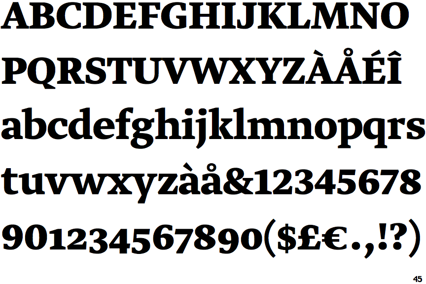
Greta Text Bold
 |
The upper-case 'Q' tail touches the circle.
|
 |
The upper-case 'J' sits on the baseline.
|
 |
The verticals of the upper-case 'M' are sloping.
|
 |
The top storey of the '3' is a smooth curve.
|
 |
The centre bar of the upper-case 'E' has no serifs.
|
 |
The foot of the '4' has no serifs.
|
 |
The tail of the upper-case 'J' has a flat end or cusp.
|
 |
The bar of the upper-case 'G' is single-sided, left-facing.
|
 |
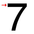
The top of the '7' has no serif or bar.
|
 |
The centre bar of the upper-case 'F' has no serifs.
|
There are more than ten differences; only the first ten are shown.
Note that the fonts in the icons shown above represent general examples, not necessarily the two fonts chosen for comparison.
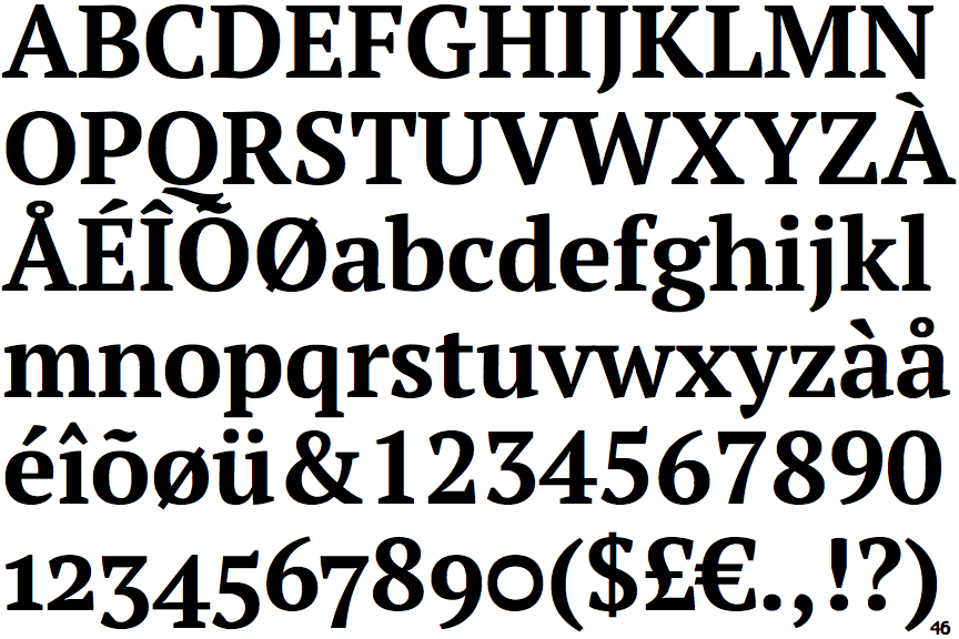
Show ExamplesPT Serif Pro Bold
 |
The upper-case 'Q' tail is below and separated from the circle.
|
 |
The upper-case 'J' descends below the baseline.
|
 |
The verticals of the upper-case 'M' are parallel.
|
 |
The top storey of the '3' is a sharp angle.
|
 |
The centre bar of the upper-case 'E' has serifs.
|
 |
The foot of the '4' has double-sided serifs.
|
 |
The tail of the upper-case 'J' has a tapered end.
|
 |
The bar of the upper-case 'G' is double-sided.
|
 |
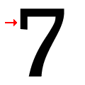
The top of the '7' has a downward-pointing serif or bar.
|
 |
The centre bar of the upper-case 'F' has serifs.
|

