 |
The upper-case 'Q' tail touches the circle.
|
 |
The diagonal strokes of the upper-case 'K' meet in a 'T'.
|
 |
The right side of the upper-case 'G' has a flat section.
|
 |
The tail of the lower-case 'y' is curved or U-shaped to the left.
|
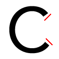 |
The ends of the upper-case 'C' stroke are angled.
|
 |
The diagonal strokes of the lower-case 'k' meet in a 'T'.
|
 |
The tail of the lower-case 't' is curved.
|
 |
The tail of the lower-case 'j' is curved with no upper serif.
|
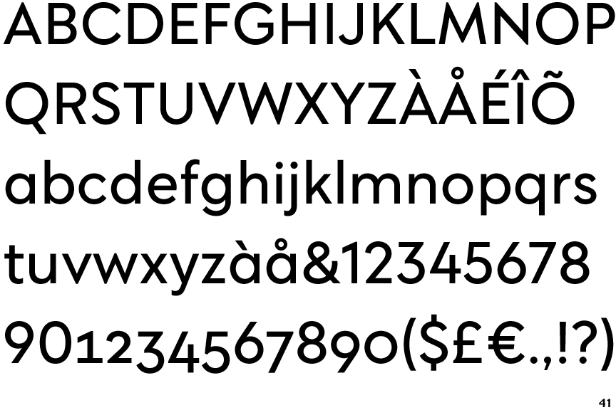
Note that the fonts in the icons shown above represent general examples, not necessarily the two fonts chosen for comparison.
Show Examples
 |
The upper-case 'Q' tail crosses the circle.
|
 |
The diagonal strokes of the upper-case 'K' meet at the vertical (with or without a gap).
|
 |
The right side of the upper-case 'G' is curved.
|
 |
The tail of the lower-case 'y' is substantially straight.
|
 |
The ends of the upper-case 'C' stroke are vertical or nearly vertical.
|
 |
The diagonal strokes of the lower-case 'k' meet at the vertical (with or without a gap).
|
 |
The tail of the lower-case 't' is straight.
|
 |
The tail of the lower-case 'j' is straight with no upper serif.
|