 |
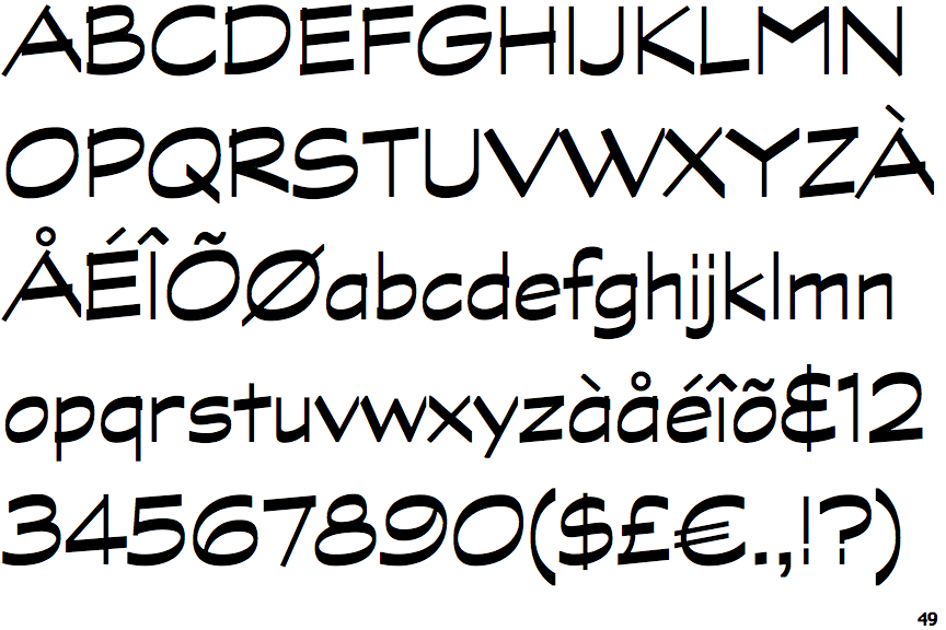
The '&' (ampersand) looks like an 'E' with a solid or broken line.
|
 |
The dot on the '?' (question-mark) is square or rectangular.
|
 |
The verticals of the upper-case 'M' are parallel.
|
 |
The upper-case 'U' has no stem/serif.
|
 |
The upper-case 'G' has no spur/tail.
|
 |
The upper-case 'G' has a bar to the left.
|
 |
The centre bar of the upper-case 'R' meets the vertical.
|
 |
The lower-case 'e' has a straight angled bar.
|
 |
The dot on the lower-case 'i' or 'j' is square or rectangular.
|
 |
The '1' (digit one) has no base.
|
There are more than ten differences; only the first ten are shown.
Note that the fonts in the icons shown above represent general examples, not necessarily the two fonts chosen for comparison.
Show Examples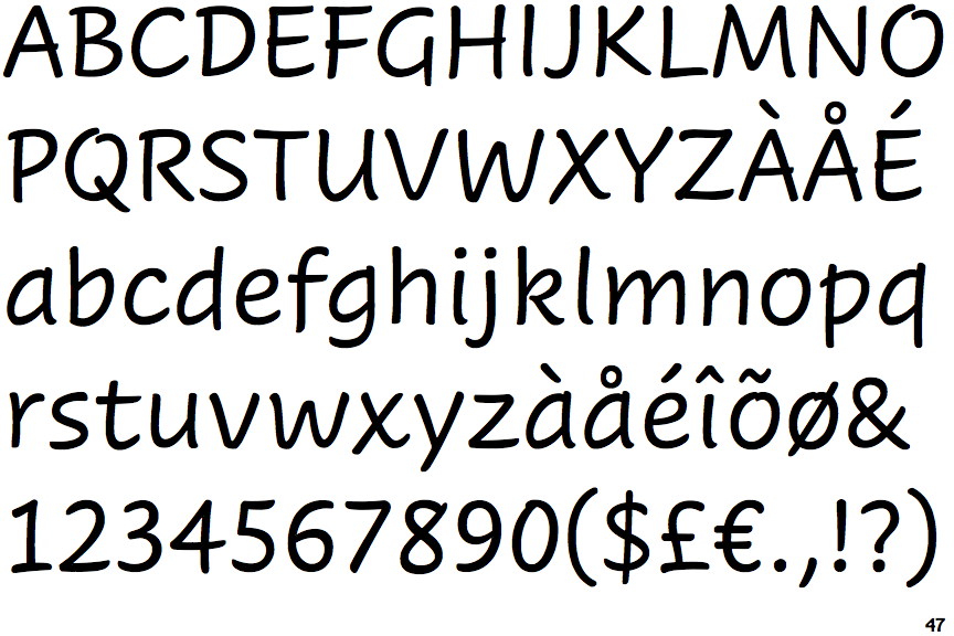
 |
The '&' (ampersand) is traditional style with two enclosed loops.
|
 |
The dot on the '?' (question-mark) is circular or oval.
|
 |
The verticals of the upper-case 'M' are sloping.
|
 |
The upper-case 'U' has a stem/serif.
|
 |
The upper-case 'G' has a spur/tail.
|
|
The upper-case 'G' has no bar.
|
 |
The centre bar of the upper-case 'R' leaves a gap with the vertical.
|
 |
The lower-case 'e' has a curved bar with no straight segment.
|
 |
The dot on the lower-case 'i' or 'j' is circular or oval.
|
 |
The '1' (digit one) has double-sided base or serifs.
|