 |
The diagonal strokes of the upper-case 'K' meet in a 'T'.
|
 |
The centre vertex of the upper-case 'M' is above the baseline.
|
 |
The centre bar of the upper-case 'P' meets the vertical.
|
 |
The upper-case 'U' has no stem/serif.
|
 |
The upper-case 'Y' arms and tail are separate strokes.
|
 |
The upper-case 'G' foot has a forward pointing spur or serif.
|
 |
The top of the upper-case 'W' has three upper terminals.
|
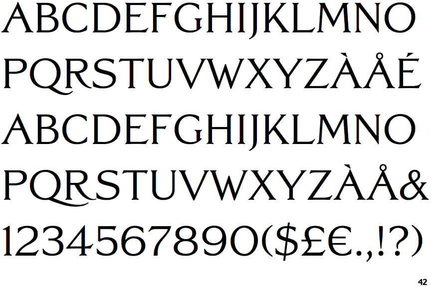
Note that the fonts in the icons shown above represent general examples, not necessarily the two fonts chosen for comparison.
Show Examples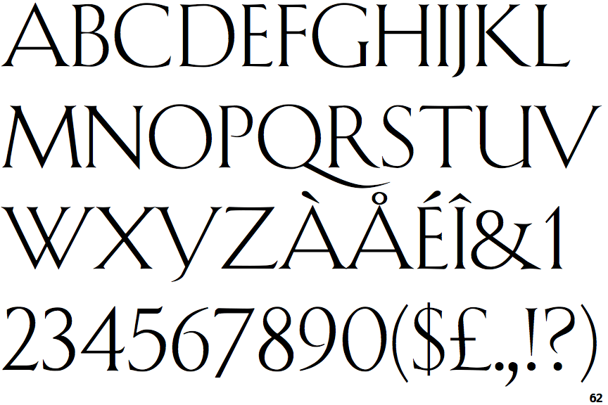
 |
The diagonal strokes of the upper-case 'K' meet at the vertical (with or without a gap).
|
 |
The centre vertex of the upper-case 'M' is on the baseline.
|
 |
The centre bar of the upper-case 'P' leaves a gap with the vertical.
|
 |
The upper-case 'U' has a stem/serif.
|
 |
The upper-case 'Y' right-hand arm forms a continuous stroke with the tail.
|
 |
The upper-case 'G' foot has no spur or serif.
|
 |
The top of the upper-case 'W' has four upper terminals.
|