Identifont

Fonts by Appearance

Fonts by Name

Fonts by Similarity

Fonts by Picture

Fonts by Designer/Publisher

Differences

TweetTweet Differences

Compare: and  

Grand Canyon

Grand Canyon

Below
The upper-case 'Q' tail is below and separated from the circle.
Closed
The '&' (ampersand) is traditional style with two enclosed loops.
Sans-serif
The characters do not have serifs.
Above
The centre vertex of the upper-case 'M' is above the baseline.
Spur
The upper-case 'G' has a spur/tail.

Note that the fonts in the icons shown above represent general examples, not necessarily the two fonts chosen for comparison.

Show Examples
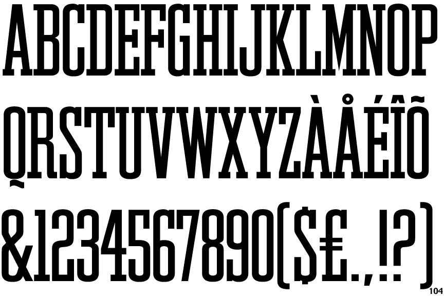
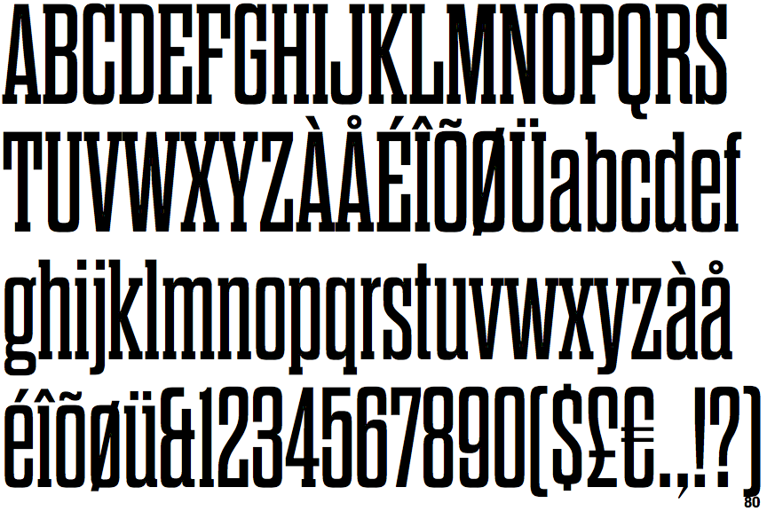
Dharma Slab

Dharma Slab

Touches
The upper-case 'Q' tail touches the circle.
Et shaped
The '&' (ampersand) looks like 'Et' with one enclosed loop (with or without exit stroke).
Serif
The characters have serifs.
Baseline
The centre vertex of the upper-case 'M' is on the baseline.
No spur
The upper-case 'G' has no spur/tail.