Identifont

Fonts by Appearance

Fonts by Name

Fonts by Similarity

Fonts by Picture

Fonts by Designer/Publisher

Differences

TweetTweet Differences

Compare: and  

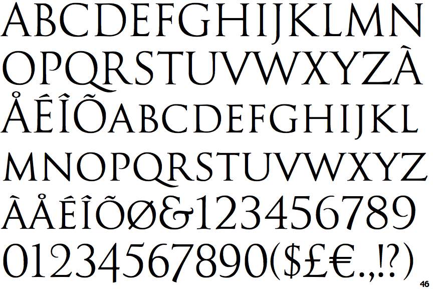
Goudy Trajan

Goudy Trajan

Gap top
The '&' (ampersand) looks like 'Et' with a gap at the top.
Flat
The tail of the upper-case 'J' has a flat end or cusp.
Both
The centre vertex of the upper-case 'W' has two separate serifs.
Two-Two
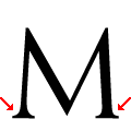
The feet of the upper-case 'M' have two serifs on each foot.

Note that the fonts in the icons shown above represent general examples, not necessarily the two fonts chosen for comparison.

Show Examples
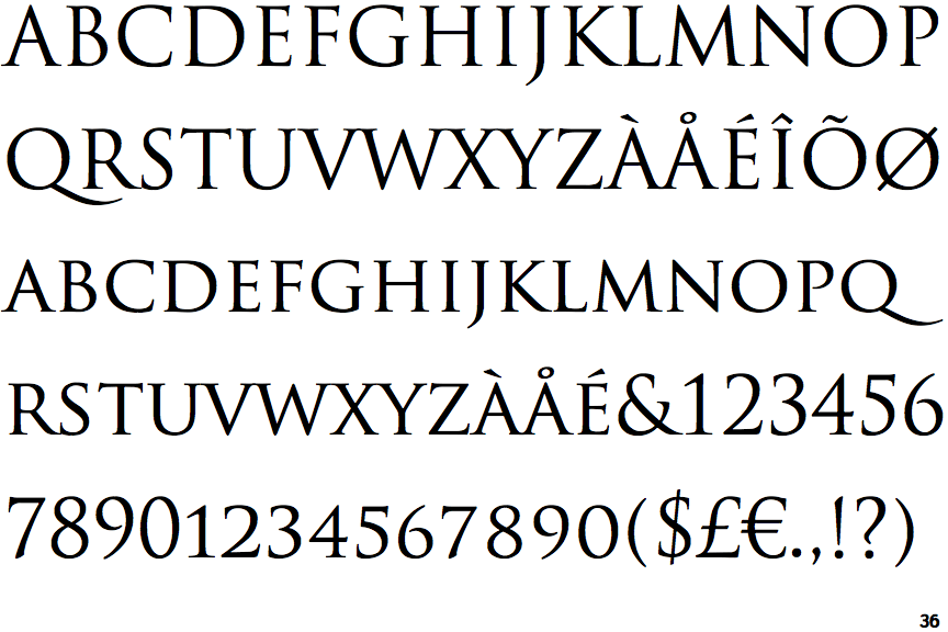
Trajan

Trajan

Open
The '&' (ampersand) is traditional style with a gap at the top.
Pointed
The tail of the upper-case 'J' has a tapered end.
None
The centre vertex of the upper-case 'W' has no serifs.
Two-One
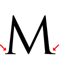
The feet of the upper-case 'M' have two serifs on the left foot, one serif on the right foot.