 |
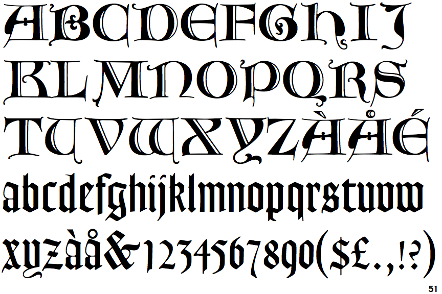
The top storey of the '3' is a sharp angle.
|
 |
The centre bar of the upper-case 'P' meets the vertical.
|
 |
The upper-case 'E' is drawn as a 'C' with a bar.
|
 |
The centre bar of the upper-case 'R' leaves a gap with the vertical.
|
 |
The foot of the '4' has no serifs.
|
 |
The sides of the lower-case 'y' are parallel (U-shaped).
|
 |
The characters are blackletter.
|
Note that the fonts in the icons shown above represent general examples, not necessarily the two fonts chosen for comparison.
Show Examples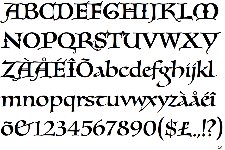
 |
The top storey of the '3' is a smooth curve.
|
 |
The centre bar of the upper-case 'P' leaves a gap with the vertical.
|
 |
The upper-case 'E' is normal letter shape.
|
 |
The centre bar of the upper-case 'R' meets the vertical.
|
 |
The foot of the '4' has double-sided serifs.
|
 |
The sides of the lower-case 'y' are angled (V-shaped).
|
 |
The characters are plain.
|