 |
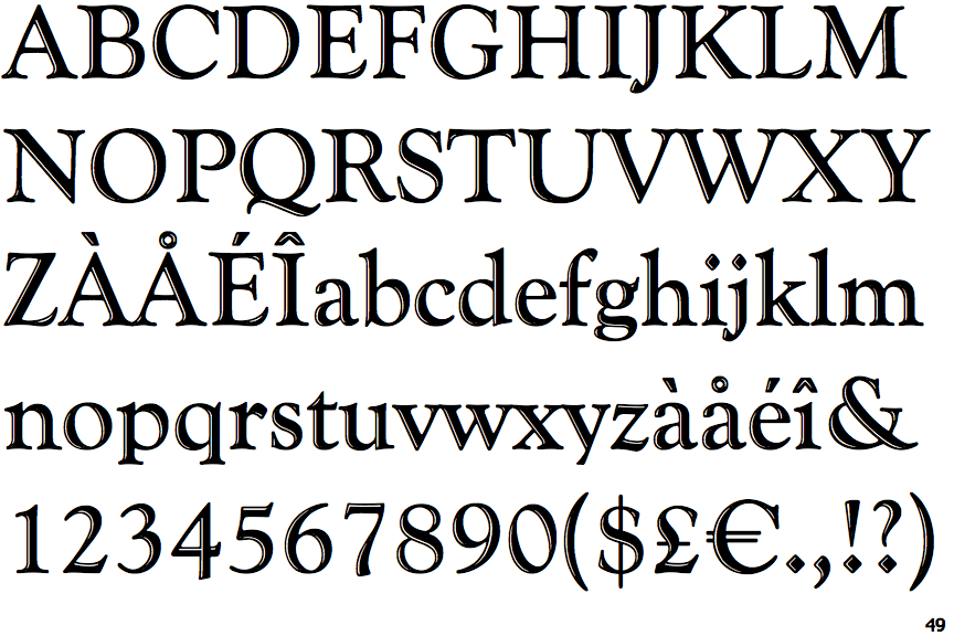
The '&' (ampersand) is traditional style with a gap at the top.
|
 |
The upper-case 'J' descends below the baseline.
|
 |
The diagonal strokes of the upper-case 'K' meet in a 'T'.
|
 |
The dot on the '?' (question-mark) is diamond-shaped or triangular.
|
 |
The top storey of the '3' is a smooth curve.
|
 |
The centre bar of the upper-case 'P' leaves a gap with the vertical.
|
 |
The top stroke of the upper-case 'C' has a vertical or angled upward-pointing serif.
|
 |
The vertex of the upper-case 'A' is pointed.
|
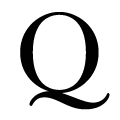 |
The tail of the upper-case 'Q' is double-sided.
|
Note that the fonts in the icons shown above represent general examples, not necessarily the two fonts chosen for comparison.
Show Examples
 |
The '&' (ampersand) is traditional style with two enclosed loops.
|
 |
The upper-case 'J' sits on the baseline.
|
 |
The diagonal strokes of the upper-case 'K' connect to the vertical via a horizontal bar.
|
 |
The dot on the '?' (question-mark) is circular or oval.
|
 |
The top storey of the '3' is a sharp angle.
|
 |
The centre bar of the upper-case 'P' meets the vertical.
|
 |
The top stroke of the upper-case 'C' has no upward-pointing serif.
|
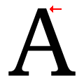 |
The vertex of the upper-case 'A' is flat.
|
 |
The tail of the upper-case 'Q' is single-sided.
|