 |
The lower-case 'a' stem stops at the top of the bowl (single storey).
|
 |
The strokes of the upper-case 'W' are like three vertical bars '|||'.
|
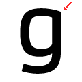 |
The lower-case 'g' has no spur or serif.
|
Note that the fonts in the icons shown above represent general examples, not necessarily the two fonts chosen for comparison.
Show Examples
 |
The lower-case 'a' stem curves over the top of the bowl (double storey).
|
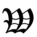 |
The strokes of the upper-case 'W' are like three closing-brackets ')))'.
|
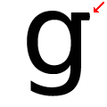 |
The lower-case 'g' has a horizontal spur or serif.
|