 |
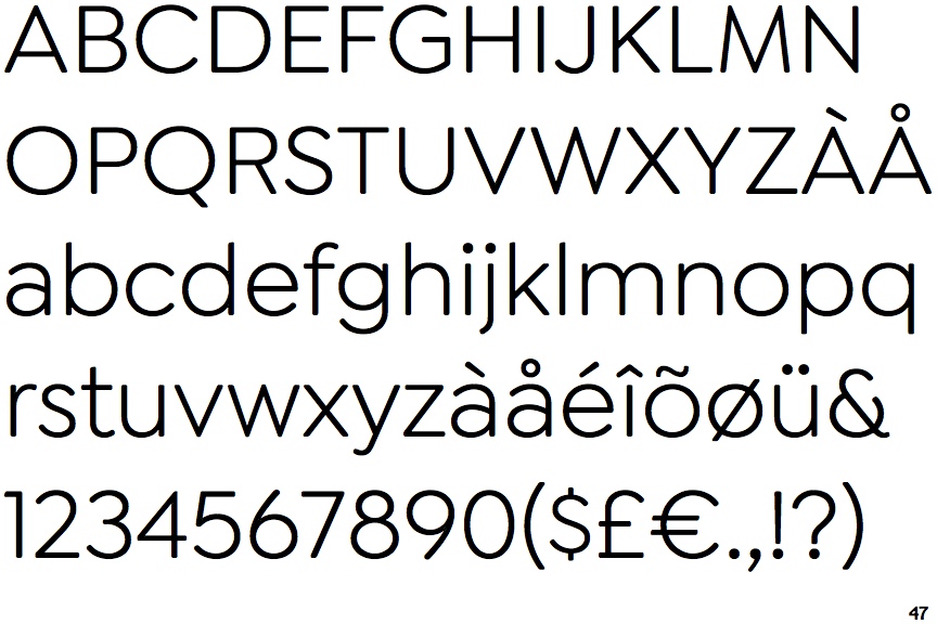
The '&' (ampersand) is traditional style with a gap at the top.
|
 |
The lower-case 'a' stem curves over the top of the bowl (double storey).
|
 |
The 'l' (lower-case 'L') has no serifs or tail.
|
 |
The upper-case 'J' has no bar.
|
 |
The leg of the upper-case 'R' is straight.
|
 |
The top of the lower-case 'q' has a vertical or slightly angled spur (pointed or flat).
|
 |
The sides of the lower-case 'y' are angled (V-shaped).
|
 |
The right side of the upper-case 'G' has a flat section.
|
 |
The tail of the upper-case 'Q' is straight (horizontal, diagonal, or vertical).
|
 |
The upper-case letter 'I' is plain.
|
There are more than ten differences; only the first ten are shown.
Note that the fonts in the icons shown above represent general examples, not necessarily the two fonts chosen for comparison.
Show Examples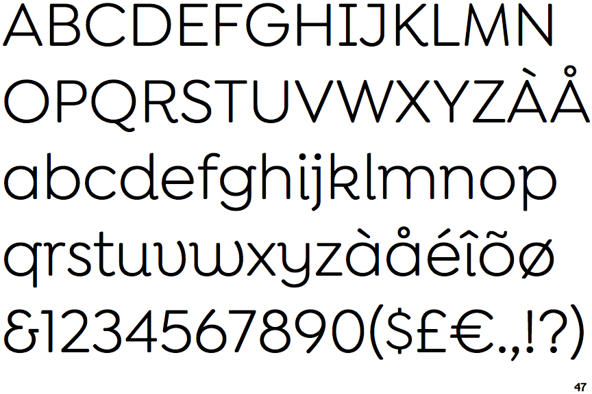
 |
The '&' (ampersand) looks like 'Et' with a gap at the top.
|
 |
The lower-case 'a' stem stops at the top of the bowl (single storey).
|
 |
The 'l' (lower-case 'L') has a right-facing lower serif or tail.
|
 |
The upper-case 'J' has a bar to the left.
|
 |
The leg of the upper-case 'R' is curved inwards.
|
 |
The top of the lower-case 'q' has a right-facing serif.
|
 |
The sides of the lower-case 'y' are parallel (U-shaped).
|
 |
The right side of the upper-case 'G' is curved.
|
 |
The tail of the upper-case 'Q' is curved, S-shaped, or Z-shaped.
|
 |
The upper-case letter 'I' has serifs/bars.
|