Identifont

Fonts by Appearance

Fonts by Name

Fonts by Similarity

Fonts by Picture

Fonts by Designer/Publisher

Differences

TweetTweet Differences

Compare: and  

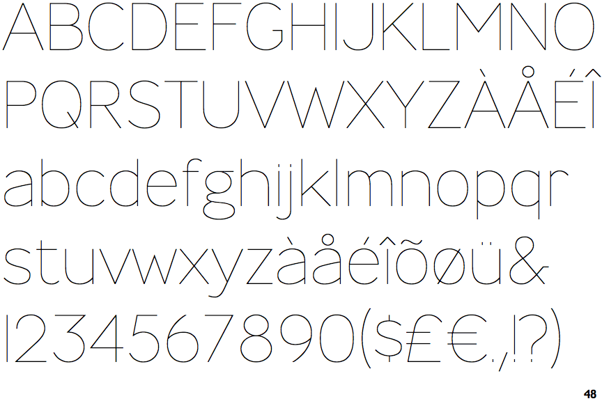
Glober Thin

Glober Thin

Touches
The upper-case 'Q' tail touches the circle.
Bar
The diagonal strokes of the upper-case 'K' connect to the vertical via a horizontal bar.
Round
The top storey of the '3' is a smooth curve.

Note that the fonts in the icons shown above represent general examples, not necessarily the two fonts chosen for comparison.

Show Examples
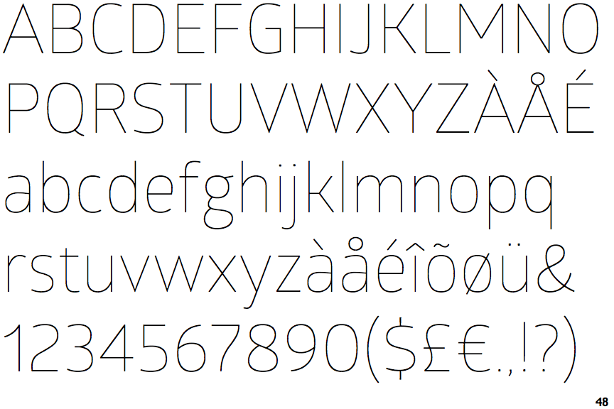
Ministry Thin

Ministry Thin

Crosses
The upper-case 'Q' tail crosses the circle.
Double
The diagonal strokes of the upper-case 'K' meet in a 'T'.
Angled
The top storey of the '3' is a sharp angle.