 |
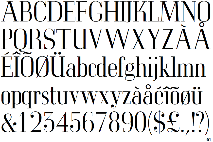
The upper-case 'J' descends below the baseline.
|
 |
The characters have serifs.
|
 |
The diagonal strokes of the upper-case 'K' connect to the vertical via a horizontal bar.
|
 |
The dot on the '?' (question-mark) is circular or oval.
|
 |
The verticals of the upper-case 'M' are sloping.
|
 |
The top storey of the '3' is a sharp angle.
|
 |
The upper-case 'U' has a stem/serif.
|
 |
The dot on the lower-case 'i' or 'j' is circular or oval.
|
Note that the fonts in the icons shown above represent general examples, not necessarily the two fonts chosen for comparison.
Show Examples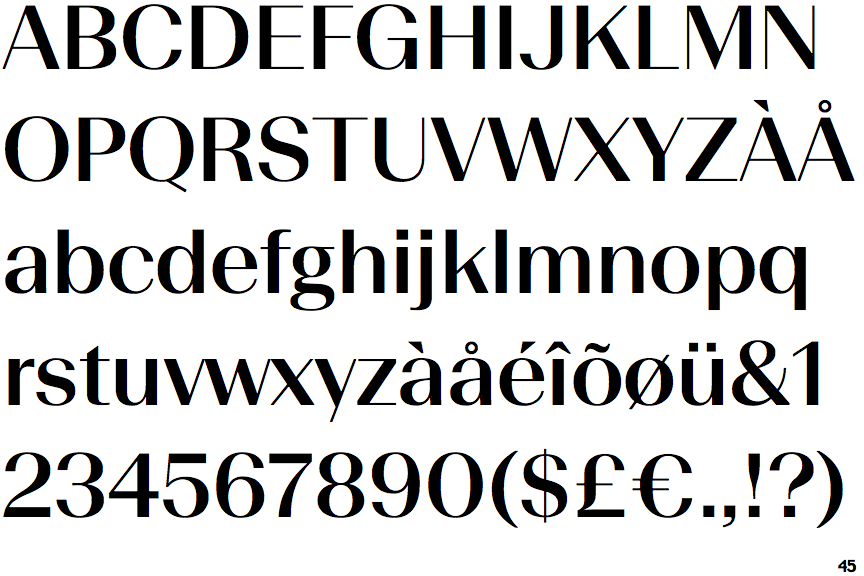
 |
The upper-case 'J' sits on the baseline.
|
 |
The characters do not have serifs.
|
 |
The diagonal strokes of the upper-case 'K' meet in a 'T'.
|
 |
The dot on the '?' (question-mark) is square or rectangular.
|
 |
The verticals of the upper-case 'M' are parallel.
|
 |
The top storey of the '3' is a smooth curve.
|
 |
The upper-case 'U' has no stem/serif.
|
 |
The dot on the lower-case 'i' or 'j' is square or rectangular.
|