 |
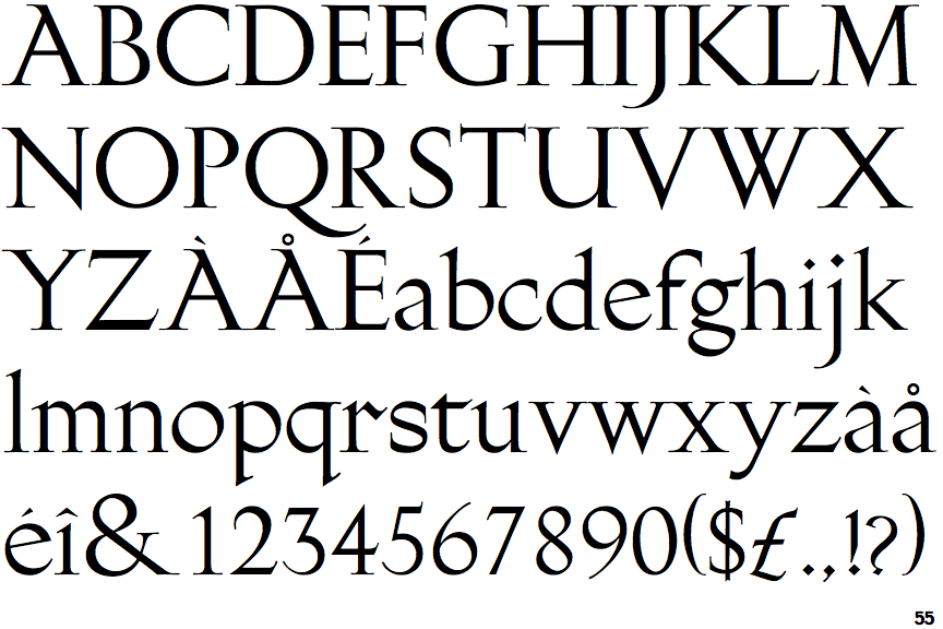
The upper-case 'Q' tail touches the circle.
|
 |
The characters have serifs.
|
 |
The centre bar of the upper-case 'P' meets the vertical.
|
 |
The upper-case 'U' has a stem/serif.
|
 |
The centre bar of the upper-case 'R' meets the vertical.
|
 |
The strokes are upright.
|
 |
The lower storey of the lower-case 'g' has no gap.
|
Note that the fonts in the icons shown above represent general examples, not necessarily the two fonts chosen for comparison.
Show Examples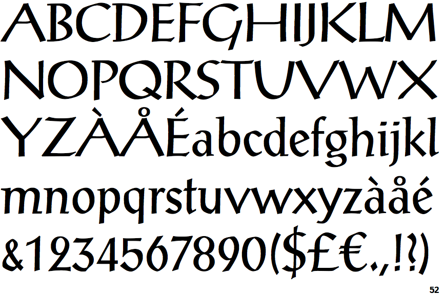
 |
The upper-case 'Q' tail crosses the circle.
|
 |
The characters do not have serifs.
|
 |
The centre bar of the upper-case 'P' leaves a gap with the vertical.
|
 |
The upper-case 'U' has no stem/serif.
|
 |
The centre bar of the upper-case 'R' leaves a gap with the vertical.
|
 |
The strokes are sloped right (italic, oblique, or cursive).
|
 |
The lower storey of the lower-case 'g' has a gap.
|