 |
The upper-case 'J' descends below the baseline.
|
 |
The diagonal strokes of the upper-case 'K' meet at the vertical (with or without a gap).
|
 |
The top storey of the '3' is a smooth curve.
|
 |
The lower-case 'g' is single-storey (with or without loop).
|
 |
The lower-case 'a' stem stops at the top of the bowl (single storey).
|
 |
The centre vertex of the upper-case 'W' has two separate serifs.
|
 |
The bar of the upper-case 'G' is double-sided.
|
 |
The dot on the lower-case 'i' or 'j' is square or rectangular.
|
 |
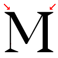
The top vertices of the upper-case 'M' have symmetrical single-sided serifs.
|
Note that the fonts in the icons shown above represent general examples, not necessarily the two fonts chosen for comparison.
Show Examples
 |
The upper-case 'J' sits on the baseline.
|
 |
The diagonal strokes of the upper-case 'K' meet in a 'T'.
|
 |
The top storey of the '3' is a sharp angle.
|
 |
The lower-case 'g' is double-storey (with or without gap).
|
 |
The lower-case 'a' stem curves over the top of the bowl (double storey).
|
 |
The centre vertex of the upper-case 'W' has no serifs.
|
 |
The bar of the upper-case 'G' is single-sided, left-facing.
|
 |
The dot on the lower-case 'i' or 'j' is circular or oval.
|
 |
The top vertices of the upper-case 'M' have one serif on the left, two on the right.
|