Identifont

Fonts by Appearance

Fonts by Name

Fonts by Similarity

Fonts by Picture

Fonts by Designer/Publisher

Differences

TweetTweet Differences

Compare: and  

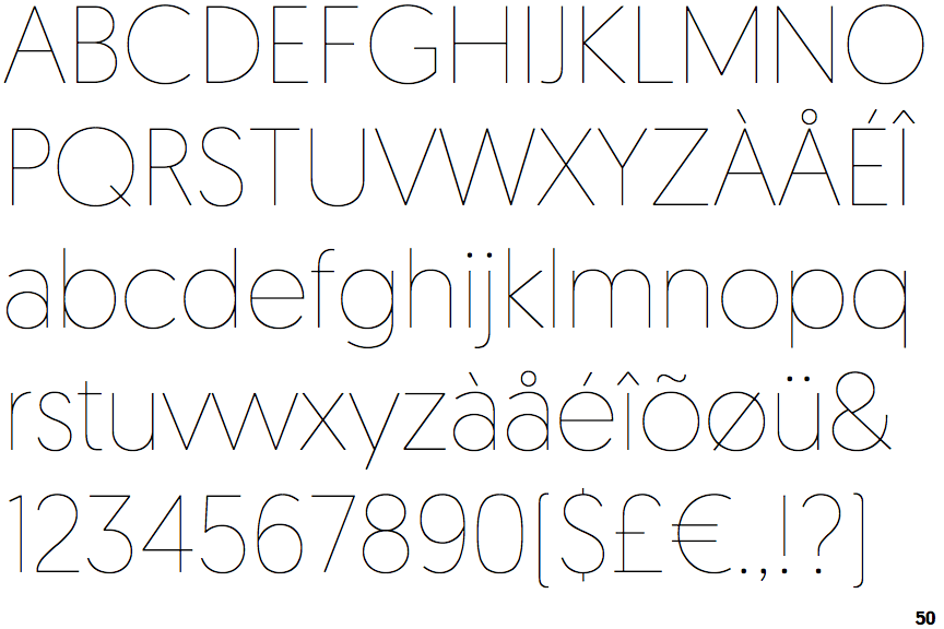
Geomanist Thin

Geomanist Thin

Single
The diagonal strokes of the upper-case 'K' meet at the vertical (with or without a gap).
2-Storey
The lower-case 'a' stem curves over the top of the bowl (double storey).
Straight
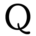
The tail of the upper-case 'Q' is straight.

Note that the fonts in the icons shown above represent general examples, not necessarily the two fonts chosen for comparison.

Show Examples
Kessel 105 Thin

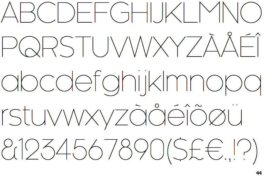
Kessel 105 Thin

Double
The diagonal strokes of the upper-case 'K' meet in a 'T'.
1-Storey
The lower-case 'a' stem stops at the top of the bowl (single storey).
Curved
The tail of the upper-case 'Q' is curved or S-shaped.