 |
The '&' (ampersand) is traditional style with two enclosed loops.
|
 |
The upper-case 'J' sits on the baseline.
|
 |
The diagonal strokes of the upper-case 'K' meet at the vertical (with or without a gap).
|
 |
The upper-case 'J' has no bar.
|
 |
The right side of the upper-case 'G' has a flat section.
|
 |
The upper-case letter 'I' is plain.
|
 |
The tail of the upper-case 'Q' is slanted.
|
 |
The upper-case 'M' vertices are flat at the top and bottom.
|
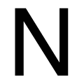 |
The upper-case 'N' vertices are flat at the top and bottom.
|
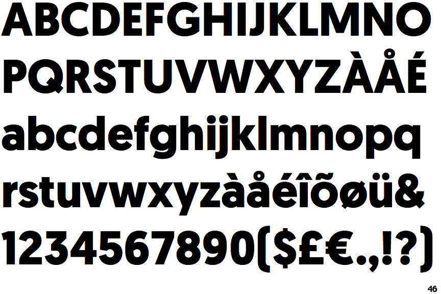
Note that the fonts in the icons shown above represent general examples, not necessarily the two fonts chosen for comparison.
Show Examples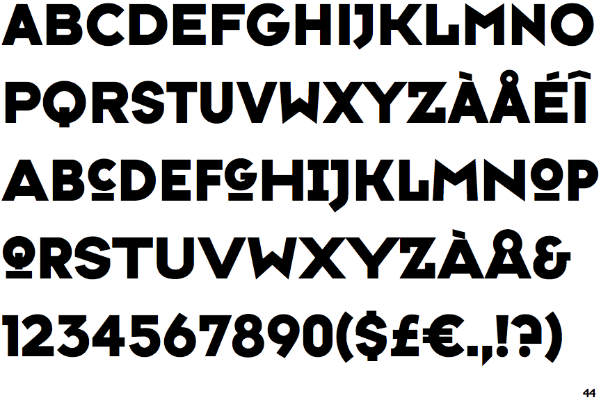
 |
The '&' (ampersand) looks like 'Et' with a gap at the top.
|
 |
The upper-case 'J' descends below the baseline.
|
 |
The diagonal strokes of the upper-case 'K' connect to the vertical via a horizontal bar.
|
 |
The upper-case 'J' has a bar to the left.
|
 |
The right side of the upper-case 'G' is curved.
|
 |
The upper-case letter 'I' has serifs/bars.
|
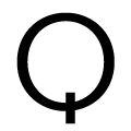 |
The tail of the upper-case 'Q' is vertical.
|
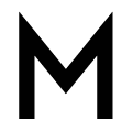 |
The upper-case 'M' vertices are pointed at the top and bottom.
|
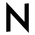 |
The upper-case 'N' vertices are pointed at the top and bottom.
|