 |
The upper-case 'Q' tail touches the circle.
|
 |
The '&' (ampersand) looks like an 'E' with a solid or broken line.
|
 |
The verticals of the upper-case 'M' are parallel.
|
 |
The centre bar of the upper-case 'P' crosses the vertical.
|
 |
The upper-case 'U' has no stem/serif.
|
 |
The upper-case 'G' has double-sided bar.
|
 |
The upper-case 'J' has no bar.
|
 |
The upper-case letter 'I' is plain.
|
 |
The upper-case 'I' is a single stroke with no serifs.
|
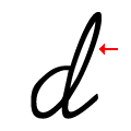 |
The stroke of the 'd' has a loop.
|
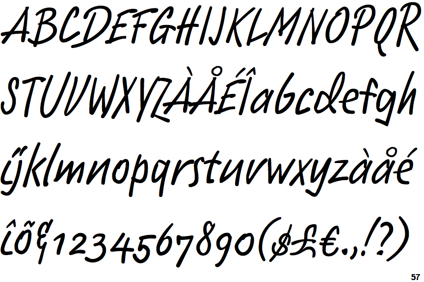
Note that the fonts in the icons shown above represent general examples, not necessarily the two fonts chosen for comparison.
Show Examples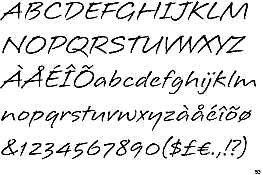
 |
The upper-case 'Q' tail crosses the circle.
|
 |
The '&' (ampersand) is traditional style with two enclosed loops.
|
 |
The verticals of the upper-case 'M' are sloping.
|
 |
The centre bar of the upper-case 'P' leaves a gap with the vertical.
|
 |
The upper-case 'U' has a stem/serif.
|
 |
The upper-case 'G' has no bar.
|
 |
The upper-case 'J' has a bar both sides.
|
 |
The upper-case letter 'I' has serifs/bars.
|
 |
The upper-case 'I' is a single stroke with serifs.
|
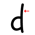 |
The stroke of the 'd' has no loop.
|