Differences
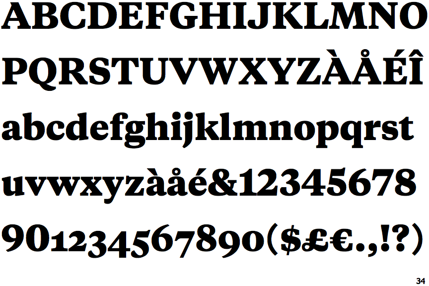
Galaxie Copernicus Heavy
 |
The '&' (ampersand) is traditional style with two enclosed loops.
|
 |
The upper-case 'J' sits on the baseline.
|
 |
The verticals of the upper-case 'M' are sloping.
|
 |
The centre bar of the upper-case 'P' meets the vertical.
|
 |
The lower-case 'g' is double-storey (with or without gap).
|
 |
The lower-case 'a' stem curves over the top of the bowl (double storey).
|
 |
The centre bar of the upper-case 'E' has serifs.
|
 |
The top of the lower-case 'q' has a vertical or slightly angled spur (pointed or flat).
|
 |
The centre vertex of the upper-case 'W' has two separate serifs.
|
 |
The bar of the upper-case 'G' is double-sided.
|
There are more than ten differences; only the first ten are shown.
Note that the fonts in the icons shown above represent general examples, not necessarily the two fonts chosen for comparison.
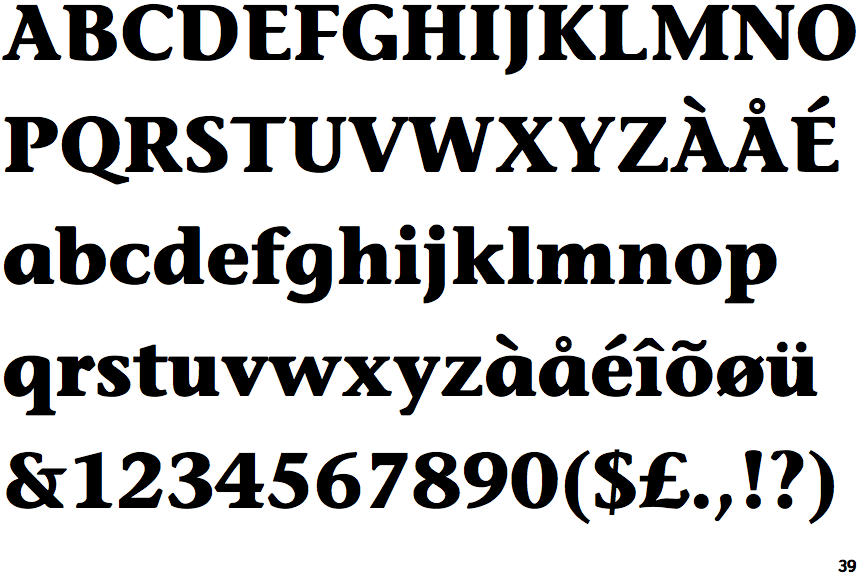
Show ExamplesITC Stone Informal Bold
 |
The '&' (ampersand) is traditional style with a gap at the top.
|
 |
The upper-case 'J' descends below the baseline.
|
 |
The verticals of the upper-case 'M' are parallel.
|
 |
The centre bar of the upper-case 'P' leaves a gap with the vertical.
|
 |
The lower-case 'g' is single-storey (with or without loop).
|
 |
The lower-case 'a' stem stops at the top of the bowl (single storey).
|
 |
The centre bar of the upper-case 'E' has no serifs.
|
 |
The top of the lower-case 'q' has no spur or serif.
|
 |
The centre vertex of the upper-case 'W' has no serifs.
|
 |
The bar of the upper-case 'G' is single-sided, left-facing.
|

