 |
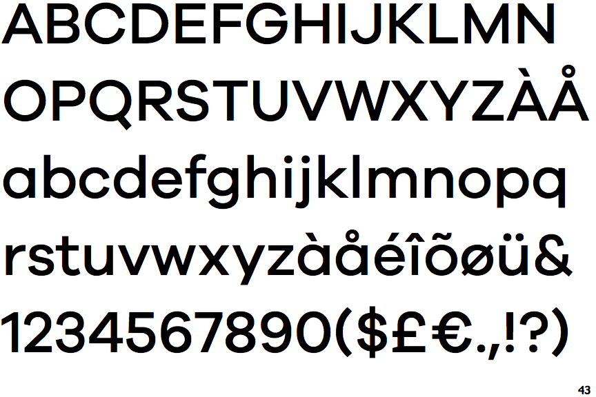
The upper-case 'Q' tail touches the circle.
|
 |
The '4' is closed.
|
 |
The verticals of the upper-case 'M' are parallel.
|
 |
The lower-case 'g' is single-storey (with or without loop).
|
 |
The lower-case 'a' stem stops at the top of the bowl (single storey).
|
 |
The upper-case 'Y' arms and tail are separate strokes.
|
 |
The right side of the upper-case 'G' is curved.
|
 |
The lower-case 'u' has a stem/serif.
|
 |
The top of the upper-case 'W' has three upper terminals.
|
Note that the fonts in the icons shown above represent general examples, not necessarily the two fonts chosen for comparison.
Show Examples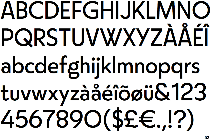
 |
The upper-case 'Q' tail crosses the circle.
|
 |
The '4' is open.
|
 |
The verticals of the upper-case 'M' are sloping.
|
 |
The lower-case 'g' is double-storey (with or without gap).
|
 |
The lower-case 'a' stem curves over the top of the bowl (double storey).
|
 |
The upper-case 'Y' right-hand arm forms a continuous stroke with the tail.
|
 |
The right side of the upper-case 'G' has a flat section.
|
 |
The lower-case 'u' has no stem/serif.
|
 |
The top of the upper-case 'W' has four upper terminals.
|