 |
The upper-case 'Q' tail crosses the circle.
|
 |
The '&' (ampersand) looks like 'Et' with a gap at the top.
|
 |
The verticals of the upper-case 'M' are parallel.
|
 |
The upper-case 'G' has a bar to the left.
|
 |
The centre bar of the upper-case 'R' meets the vertical.
|
 |
The character outlines are corroded, roughened, or dirty.
|
 |
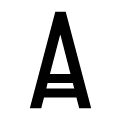
The top of the upper-case 'W' has four upper terminals.
|
 |
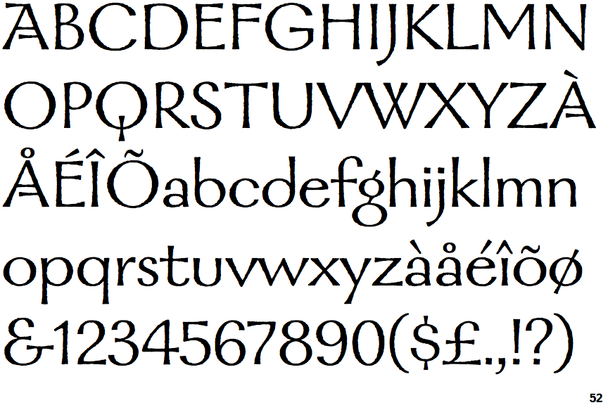
The bar of the upper-case 'A' is a double or triple line.
|
 |
The centre vertex of the upper-case 'W' is level with the outer strokes.
|
Note that the fonts in the icons shown above represent general examples, not necessarily the two fonts chosen for comparison.
Show Examples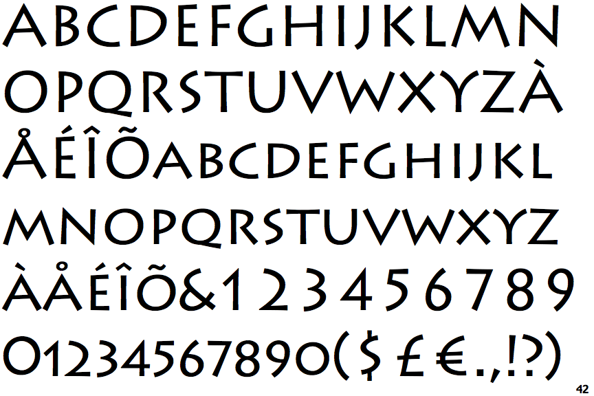
 |
The upper-case 'Q' tail touches the circle.
|
 |
The '&' (ampersand) is traditional style with a gap at the top.
|
 |
The verticals of the upper-case 'M' are sloping.
|
 |
The upper-case 'G' has no bar.
|
 |
The centre bar of the upper-case 'R' leaves a gap with the vertical.
|
 |
The character outlines are smooth/sharp.
|
 |
The top of the upper-case 'W' has three upper terminals.
|
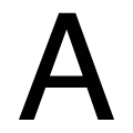 |
The bar of the upper-case 'A' is a single horizontal line.
|
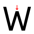 |
The centre vertex of the upper-case 'W' is below the outer strokes.
|