Differences
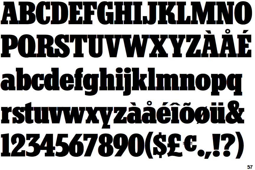
Galactic
 |
The '&' (ampersand) looks like 'Et' with a gap at the top.
|
 |
The top storey of the '3' is a sharp angle.
|
 |
The lower-case 'g' is single-storey (with or without loop).
|
 |
The centre bar of the upper-case 'E' has no serifs.
|
 |
The upper-case 'G' foot has a downward pointing spur.
|
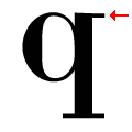 |
The top of the lower-case 'q' has a right-facing serif.
|
 |
The tail of the upper-case 'J' has a flat end or cusp.
|
 |
The centre vertex of the upper-case 'W' has no serifs.
|
 |
The feet of the lower-case 'h' have two serifs on the left and one on the right.
|
 |
The centre bar of the upper-case 'F' has no serifs.
|
There are more than ten differences; only the first ten are shown.
Note that the fonts in the icons shown above represent general examples, not necessarily the two fonts chosen for comparison.
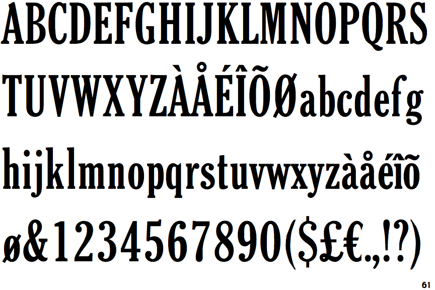
Show ExamplesCheltenham Bold Extra Condensed
 |
The '&' (ampersand) is traditional style with two enclosed loops.
|
 |
The top storey of the '3' is a smooth curve.
|
 |
The lower-case 'g' is double-storey (with or without gap).
|
 |
The centre bar of the upper-case 'E' has serifs.
|
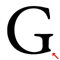 |
The upper-case 'G' foot has a forward pointing spur or serif.
|
 |
The top of the lower-case 'q' has a vertical or slightly angled spur (pointed or flat).
|
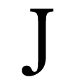 |
The tail of the upper-case 'J' has a rounded end or ball.
|
 |
The centre vertex of the upper-case 'W' has two separate serifs.
|
 |
The feet of the lower-case 'h' have two serifs on each foot.
|
 |
The centre bar of the upper-case 'F' has serifs.
|
