 |
The upper-case 'Q' tail touches the circle.
|
 |
The '4' is open.
|
 |
The diagonal strokes of the upper-case 'K' meet at the vertical (with or without a gap).
|
 |
The centre vertex of the upper-case 'M' is on the baseline.
|
 |
The top storey of the '3' is a smooth curve.
|
 |
The upper-case 'G' has double-sided bar.
|
 |
The upper-case 'Y' right-hand arm forms a continuous stroke with the tail.
|
 |
The sides of the lower-case 'y' are parallel (U-shaped).
|
 |
The right side of the upper-case 'G' is curved.
|
 |
The tail of the lower-case 'y' is curved or U-shaped to the left.
|
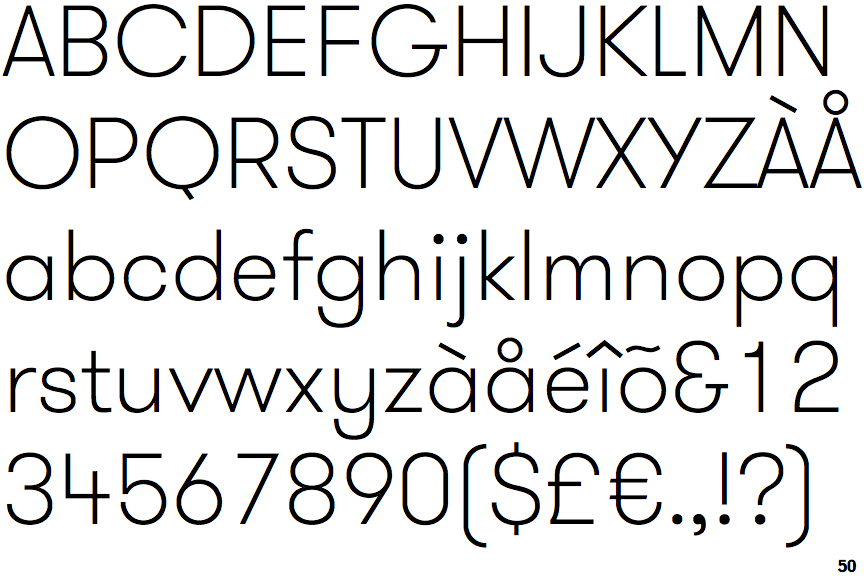
Note that the fonts in the icons shown above represent general examples, not necessarily the two fonts chosen for comparison.
Show Examples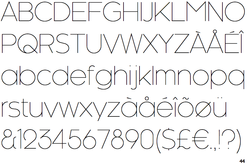
 |
The upper-case 'Q' tail crosses the circle.
|
 |
The '4' is closed.
|
 |
The diagonal strokes of the upper-case 'K' meet in a 'T'.
|
 |
The centre vertex of the upper-case 'M' is above the baseline.
|
 |
The top storey of the '3' is a sharp angle.
|
 |
The upper-case 'G' has a bar to the left.
|
 |
The upper-case 'Y' arms and tail are separate strokes.
|
 |
The sides of the lower-case 'y' are angled (V-shaped).
|
 |
The right side of the upper-case 'G' has a flat section.
|
 |
The tail of the lower-case 'y' is substantially straight.
|