 |
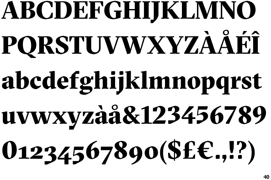
The '$' (dollar) has a single line crossing the 'S'.
|
 |
The '4' is open.
|
 |
The verticals of the upper-case 'M' are parallel.
|
 |
The top of the lower-case 'q' has a vertical or slightly angled spur (pointed or flat).
|
 |
The foot of the '4' has no serifs.
|
 |
The centre vertex of the upper-case 'W' has two separate serifs.
|
 |
The upper-case 'C' is symmetrical about a horizontal axis.
|
Note that the fonts in the icons shown above represent general examples, not necessarily the two fonts chosen for comparison.
Show Examples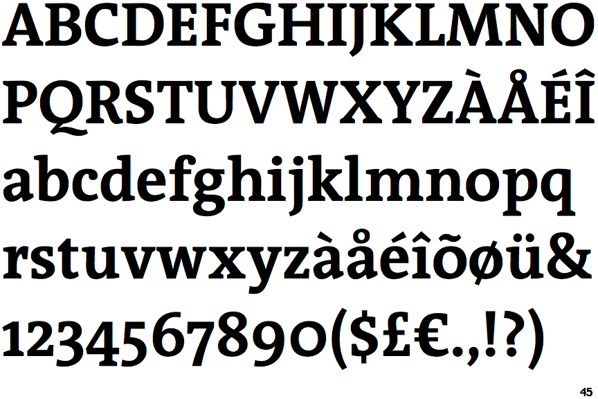
 |
The '$' (dollar) has a single line which does not cross the 'S'.
|
 |
The '4' is closed.
|
 |
The verticals of the upper-case 'M' are sloping.
|
 |
The top of the lower-case 'q' has no spur or serif.
|
 |
The foot of the '4' has double-sided serifs.
|
 |
The centre vertex of the upper-case 'W' has no serifs.
|
 |
The upper-case 'C' is asymmetrical about a horizontal axis.
|