 |
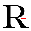
The leg of the upper-case 'R' is cut away at the bowl.
|
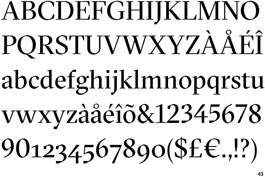
Note that the fonts in the icons shown above represent general examples, not necessarily the two fonts chosen for comparison.
Show Examples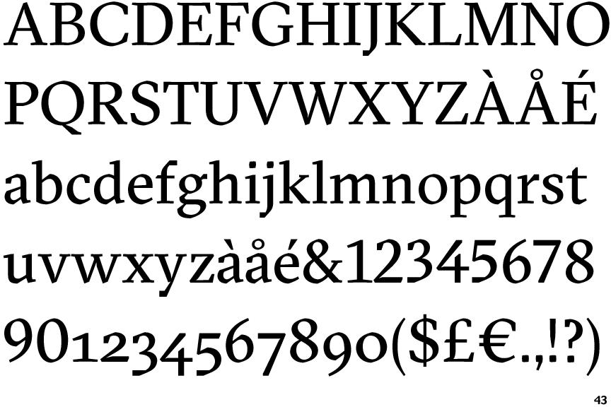
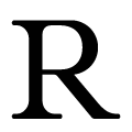 |
The leg of the upper-case 'R' joins the bowl smoothly.
|