Differences
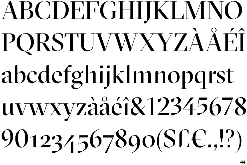
GT Sectra Display
 |
The '4' is open.
|
 |
The verticals of the upper-case 'M' are parallel.
|
 |
The top of the lower-case 'q' has a vertical or slightly angled spur (pointed or flat).
|
 |
The tail of the upper-case 'J' has a flat end or cusp.
|
 |
The centre vertex of the upper-case 'W' has two separate serifs.
|
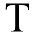 |
The top of the upper-case 'T' has a flat top.
|
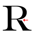 |
The leg of the upper-case 'R' is cut away at the bowl.
|
Note that the fonts in the icons shown above represent general examples, not necessarily the two fonts chosen for comparison.
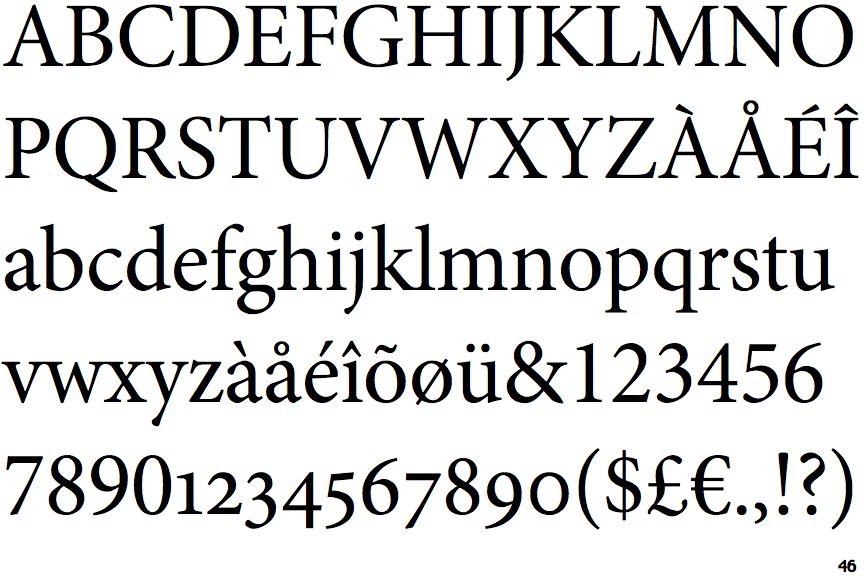
Show ExamplesMinion Subhead
 |
The '4' is closed.
|
 |
The verticals of the upper-case 'M' are sloping.
|
 |
The top of the lower-case 'q' has no spur or serif.
|
 |
The tail of the upper-case 'J' has a tapered end.
|
 |
The centre vertex of the upper-case 'W' has no serifs.
|
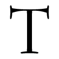 |
The top of the upper-case 'T' has upward-pointing serifs.
|
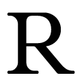 |
The leg of the upper-case 'R' joins the bowl smoothly.
|
