Differences
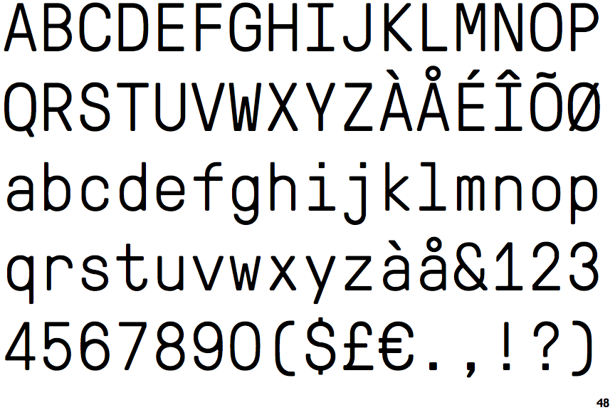
GT Pressura Mono Light
 |
The upper-case 'Q' tail touches the circle.
|
 |
The centre vertex of the upper-case 'M' is above the baseline.
|
 |
The dot on the '?' (question-mark) is square or rectangular.
|
 |
The verticals of the upper-case 'M' are parallel.
|
 |
The lower-case 'g' is single-storey (with or without loop).
|
 |
The upper-case 'G' has a bar to the left.
|
 |
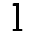
The 'l' (lower-case 'L') has a left-facing upper serif and double lower serifs.
|
 |
The upper-case 'J' has no bar.
|
 |
The top of the lower-case 'q' has a vertical or slightly angled spur (pointed or flat).
|
 |
The lower-case 'e' has a straight horizontal bar.
|
There are more than ten differences; only the first ten are shown.
Note that the fonts in the icons shown above represent general examples, not necessarily the two fonts chosen for comparison.
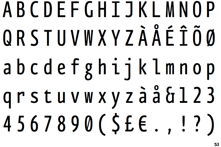
Show ExamplesFF Eureka Mono Condensed
 |
The upper-case 'Q' tail crosses the circle.
|
 |
The centre vertex of the upper-case 'M' is on the baseline.
|
 |
The dot on the '?' (question-mark) is circular or oval.
|
 |
The verticals of the upper-case 'M' are sloping.
|
 |
The lower-case 'g' is double-storey (with or without gap).
|
 |
The upper-case 'G' has no bar.
|
 |
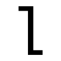
The 'l' (lower-case 'L') has a left-facing upper serif and right-facing lower serif or tail.
|
 |
The upper-case 'J' has a bar to the left.
|
 |
The top of the lower-case 'q' has no spur or serif.
|
 |
The lower-case 'e' has a straight angled bar.
|

