Identifont

Fonts by Appearance

Fonts by Name

Fonts by Similarity

Fonts by Picture

Fonts by Designer/Publisher

Differences

TweetTweet Differences

Compare: and  

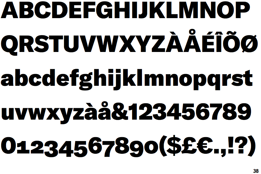
GT America Black

GT America Black

Straight
The leg of the upper-case 'R' is straight.
Curved
The tail of the upper-case 'Q' is curved, S-shaped, or Z-shaped.
Left
The tail of the lower-case 'y' is curved or U-shaped to the left.
Angled
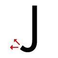
The tail of the upper-case 'J' points horizontally or slightly upwards.

Note that the fonts in the icons shown above represent general examples, not necessarily the two fonts chosen for comparison.

Show Examples
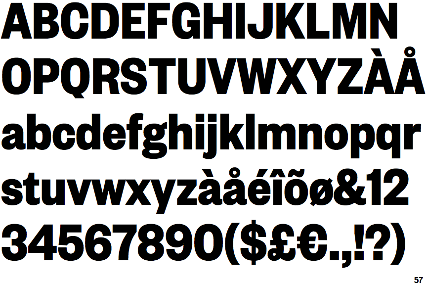
Founders Grotesk Condensed Bold

Founders Grotesk Condensed Bold

Outwards
The leg of the upper-case 'R' is curved outwards.
Straight
The tail of the upper-case 'Q' is straight (horizontal, diagonal, or vertical).
Straight
The tail of the lower-case 'y' is substantially straight.
Vertical
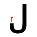
The tail of the upper-case 'J' points vertically.