Identifont

Fonts by Appearance

Fonts by Name

Fonts by Similarity

Fonts by Picture

Fonts by Designer/Publisher

Differences

TweetTweet Differences

Compare: and  

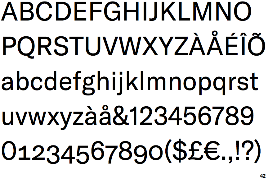
GT America

GT America

Double
The diagonal strokes of the upper-case 'K' meet in a 'T'.
Round
The top storey of the '3' is a smooth curve.
Straight
The leg of the upper-case 'R' is straight.
Angled
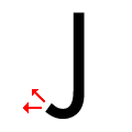
The tail of the upper-case 'J' points horizontally or slightly upwards.

Note that the fonts in the icons shown above represent general examples, not necessarily the two fonts chosen for comparison.

Show Examples
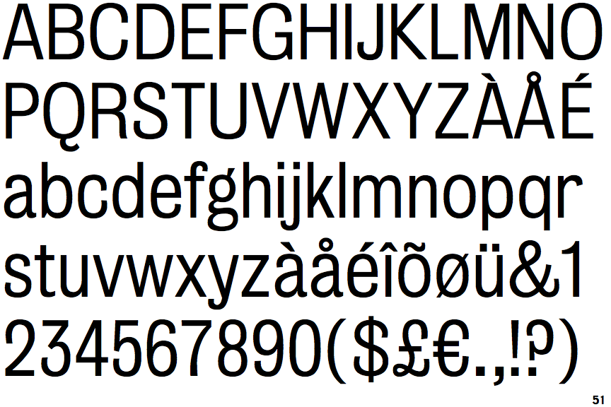
Bureau Grot Light

Bureau Grot Light

Single
The diagonal strokes of the upper-case 'K' meet at the vertical (with or without a gap).
Angled
The top storey of the '3' is a sharp angle.
Outwards
The leg of the upper-case 'R' is curved outwards.
Vertical
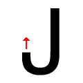
The tail of the upper-case 'J' points vertically.