Differences
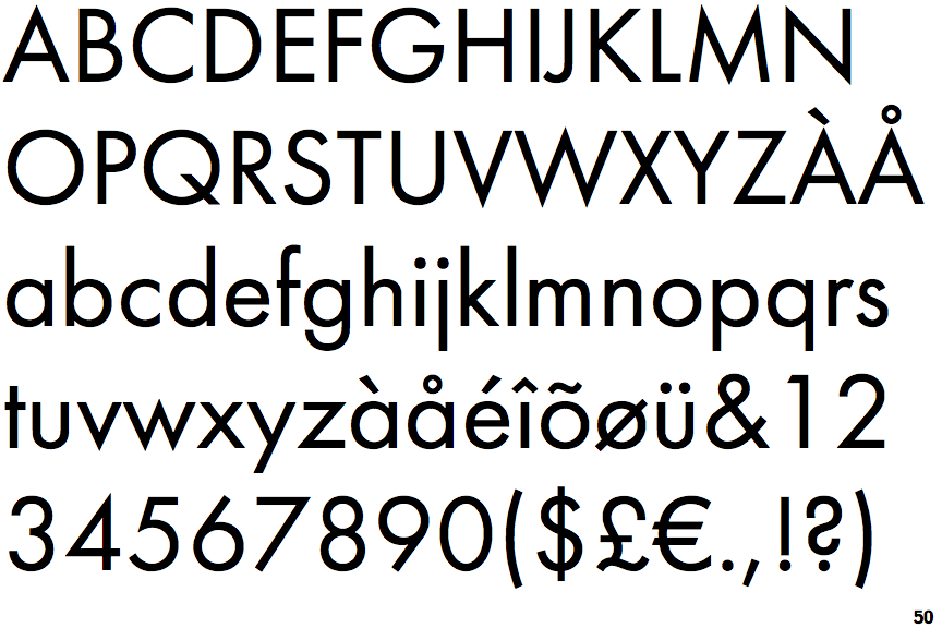
Futura PT
 |
The '&' (ampersand) is traditional style with two enclosed loops.
|
 |
The leg of the upper-case 'R' is straight.
|
 |
The centre bar of the upper-case 'R' meets the vertical.
|
 |
The right side of the upper-case 'G' is curved.
|
 |
The centre strokes of the upper-case 'W' meet at a vertex.
|
Note that the fonts in the icons shown above represent general examples, not necessarily the two fonts chosen for comparison.
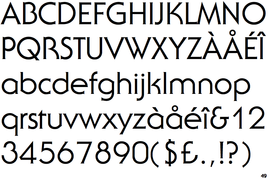
Show ExamplesITC Serif Gothic
 |
The '&' (ampersand) looks like 'Et' with a gap at the top.
|
 |
The leg of the upper-case 'R' is curved outwards.
|
 |
The centre bar of the upper-case 'R' leaves a gap with the vertical.
|
 |
The right side of the upper-case 'G' has a flat section.
|
 |
The centre strokes of the upper-case 'W' meet in a T on the left.
|

