Differences
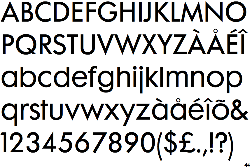
Futura Maxi
 |
The '$' (dollar) has a single line crossing the 'S'.
|
 |
The diagonal strokes of the upper-case 'K' meet at the vertical (with or without a gap).
|
 |
The dot on the '?' (question-mark) is circular or oval.
|
 |
The verticals of the upper-case 'M' are sloping.
|
 |
The centre bar of the upper-case 'R' meets the vertical.
|
 |
The dot on the lower-case 'i' or 'j' is circular or oval.
|
 |
The tail of the upper-case 'Q' is straight.
|
 |
The lower-case 'u' has no stem/serif.
|
 |
The upper-case 'M' vertices are pointed at the top and bottom.
|
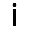 |
The tail of the lower-case 'j' is straight with no upper serif.
|
There are more than ten differences; only the first ten are shown.
Note that the fonts in the icons shown above represent general examples, not necessarily the two fonts chosen for comparison.
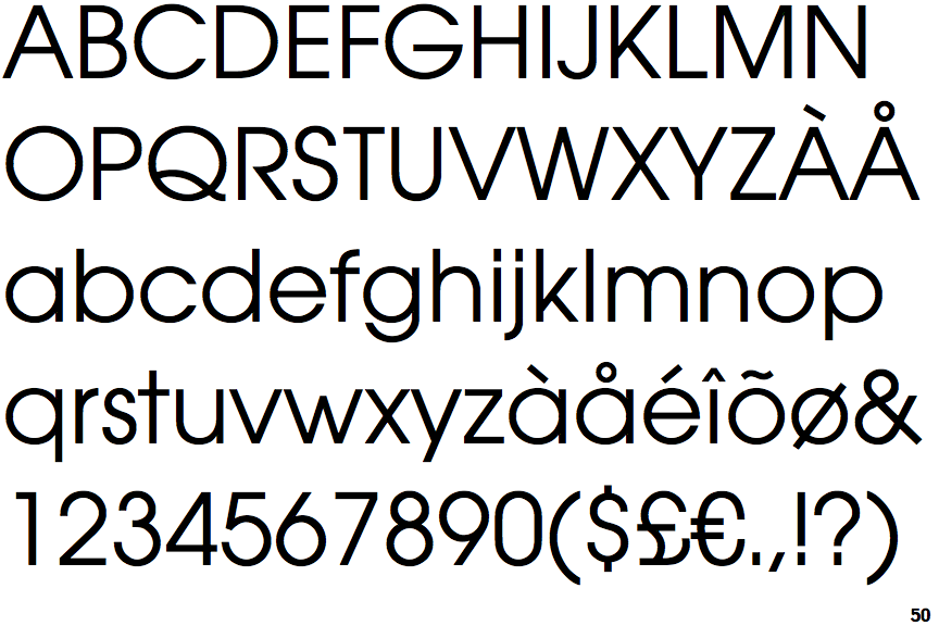
Show ExamplesITC Avant Garde (EF)
 |
The '$' (dollar) has a single line which does not cross the 'S'.
|
 |
The diagonal strokes of the upper-case 'K' meet in a 'T'.
|
 |
The dot on the '?' (question-mark) is square or rectangular.
|
 |
The verticals of the upper-case 'M' are parallel.
|
 |
The centre bar of the upper-case 'R' leaves a gap with the vertical.
|
 |
The dot on the lower-case 'i' or 'j' is square or rectangular.
|
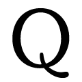 |
The tail of the upper-case 'Q' is curved or S-shaped.
|
 |
The lower-case 'u' has a stem/serif.
|
 |
The upper-case 'M' vertices are flat at the top and bottom.
|
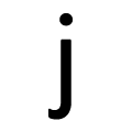 |
The tail of the lower-case 'j' is curved with no upper serif.
|
