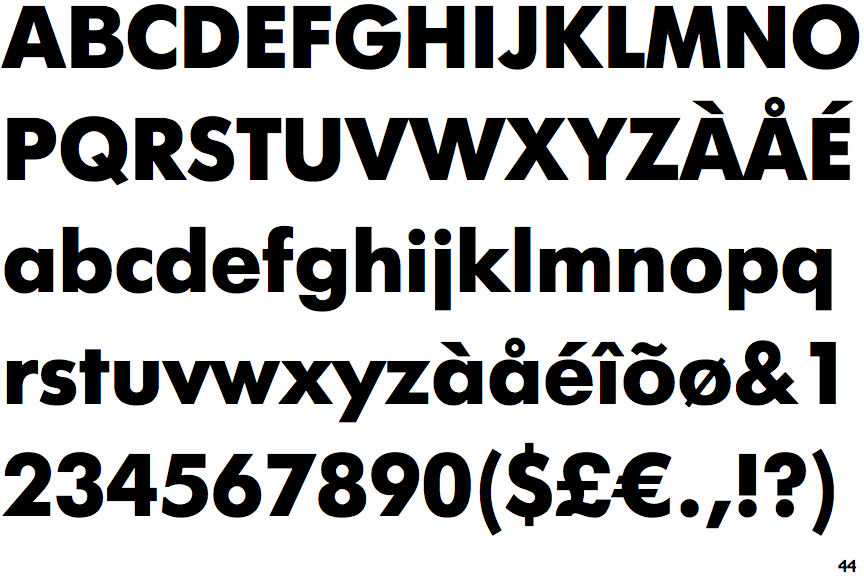
 |
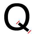
The ends of the upper-case 'Q' tail are both diagonal.
|
Note that the fonts in the icons shown above represent general examples, not necessarily the two fonts chosen for comparison.
Show Examples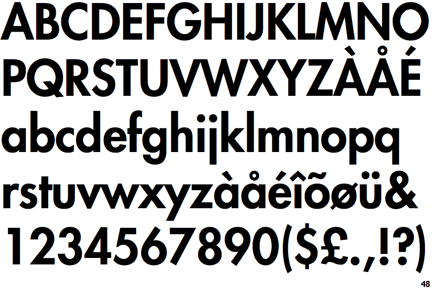
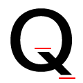 |
The ends of the upper-case 'Q' tail are both horizontal.
|