Identifont

Fonts by Appearance

Fonts by Name

Fonts by Similarity

Fonts by Picture

Fonts by Designer/Publisher

Differences

TweetTweet Differences

Compare: and  

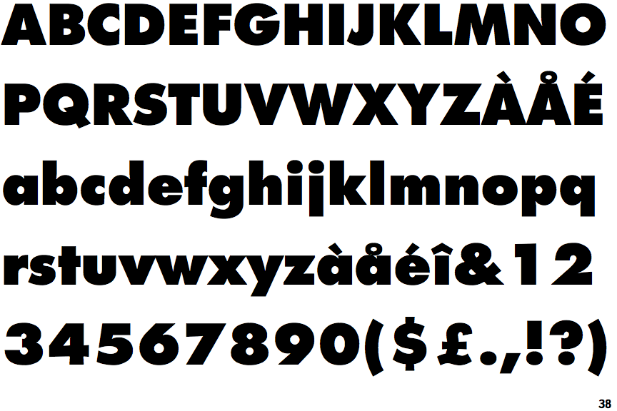
Futura Extra Bold

Futura Extra Bold

Crosses
The upper-case 'Q' tail crosses the circle.
1-Storey
The lower-case 'a' stem stops at the top of the bowl (single storey).
Curved
The right side of the upper-case 'G' is curved.
No-Stem
The lower-case 'u' has no stem/serif.
Straight
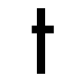
The tail of the lower-case 't' is straight.

Note that the fonts in the icons shown above represent general examples, not necessarily the two fonts chosen for comparison.

Show Examples
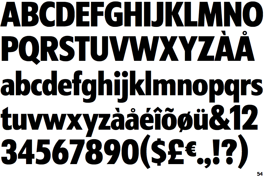
Swank Gothic Condensed Bold

Swank Gothic Condensed Bold

Touches
The upper-case 'Q' tail touches the circle.
2-Storey
The lower-case 'a' stem curves over the top of the bowl (double storey).
Flat
The right side of the upper-case 'G' has a flat section.
Stem
The lower-case 'u' has a stem/serif.
Curved
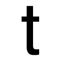
The tail of the lower-case 't' is curved.