 |
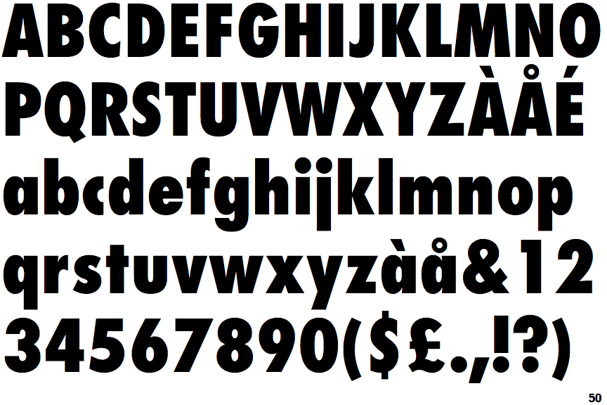
The upper-case 'Q' tail touches the circle.
|
 |
The lower-case 'a' stem stops at the top of the bowl (single storey).
|
 |
The upper-case 'G' has a bar to the left.
|
 |
The 'l' (lower-case 'L') has no serifs or tail.
|
 |
The top of the lower-case 'q' has a vertical or slightly angled spur (pointed or flat).
|
 |
The right side of the upper-case 'G' is curved.
|
 |
The tail of the lower-case 'y' is substantially straight.
|
 |
The lower-case 'u' has no stem/serif.
|
 |
The lower-case 'i' has no serifs or tail.
|
Note that the fonts in the icons shown above represent general examples, not necessarily the two fonts chosen for comparison.
Show Examples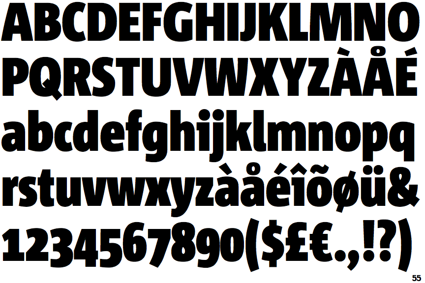
 |
The upper-case 'Q' tail crosses the circle.
|
 |
The lower-case 'a' stem curves over the top of the bowl (double storey).
|
 |
The upper-case 'G' has no bar.
|
 |
The 'l' (lower-case 'L') has a right-facing lower serif or tail.
|
 |
The top of the lower-case 'q' has no spur or serif.
|
 |
The right side of the upper-case 'G' has a flat section.
|
 |
The tail of the lower-case 'y' is curved or U-shaped to the left.
|
 |
The lower-case 'u' has a stem/serif.
|
 |
The lower-case 'i' has a left-facing upper serif.
|