 |
The verticals of the upper-case 'M' are sloping.
|
 |
The upper-case 'G' has no bar.
|
 |
The lower-case 'u' has no stem/serif.
|
 |
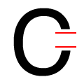
The ends of the upper-case 'C' stroke are vertical or nearly vertical.
|
 |
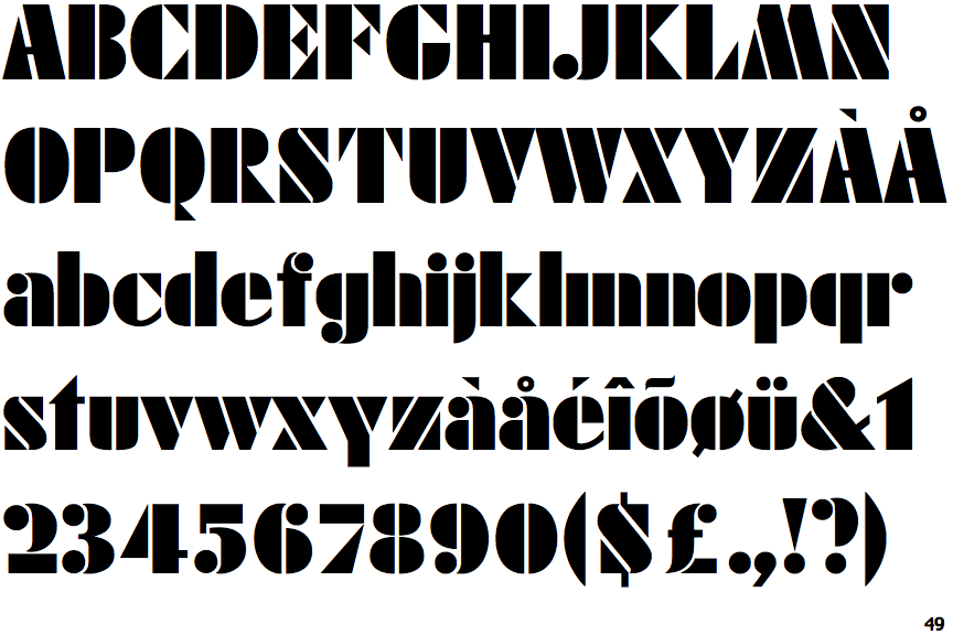
The characters are divided into separate segments (stencil).
|
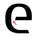 |
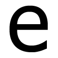
The centre bar of the lower-case 'e' leaves a gap with the vertical.
|
Note that the fonts in the icons shown above represent general examples, not necessarily the two fonts chosen for comparison.
Show Examples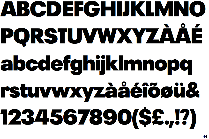
 |
The verticals of the upper-case 'M' are parallel.
|
 |
The upper-case 'G' has a bar to the left.
|
 |
The lower-case 'u' has a stem/serif.
|
 |
The ends of the upper-case 'C' stroke are horizontal or nearly horizontal.
|
 |
The characters are whole.
|
 |
The centre bar of the lower-case 'e' meets the vertical.
|