Identifont

Fonts by Appearance

Fonts by Name

Fonts by Similarity

Fonts by Picture

Fonts by Designer/Publisher

Differences

TweetTweet Differences

Compare: and  

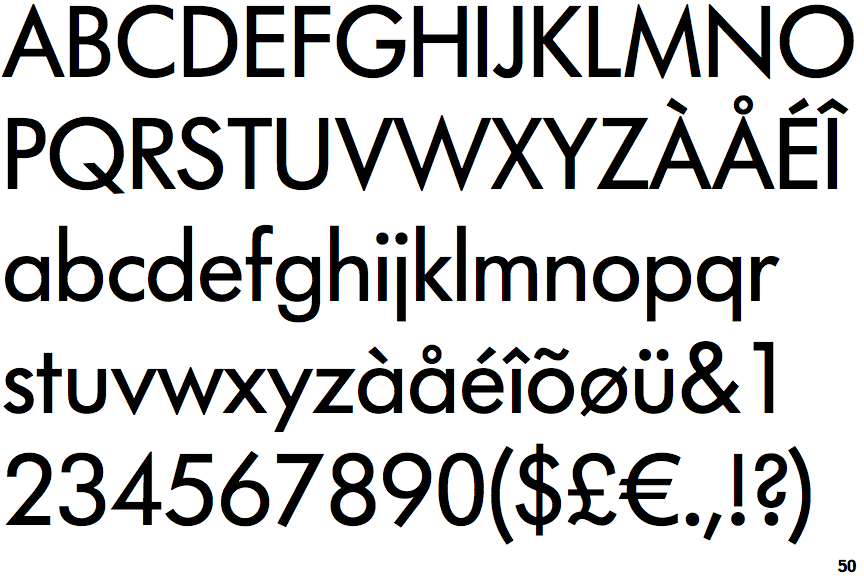
Futura (Berthold)

Futura (Berthold)

Single
The diagonal strokes of the upper-case 'K' meet at the vertical (with or without a gap).
No-Stem
The lower-case 'u' has no stem/serif.
Pointed-Pointed
The upper-case 'M' vertices are pointed at the top and bottom.

Note that the fonts in the icons shown above represent general examples, not necessarily the two fonts chosen for comparison.

Show Examples
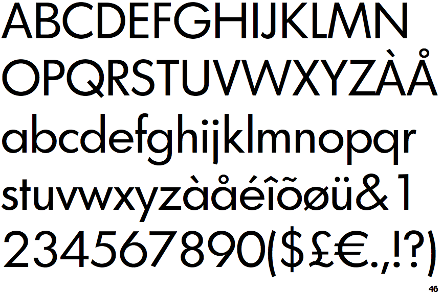
Graphicus DT

Graphicus DT

Double
The diagonal strokes of the upper-case 'K' meet in a 'T'.
Stem
The lower-case 'u' has a stem/serif.
Flat-Flat
The upper-case 'M' vertices are flat at the top and bottom.