 |
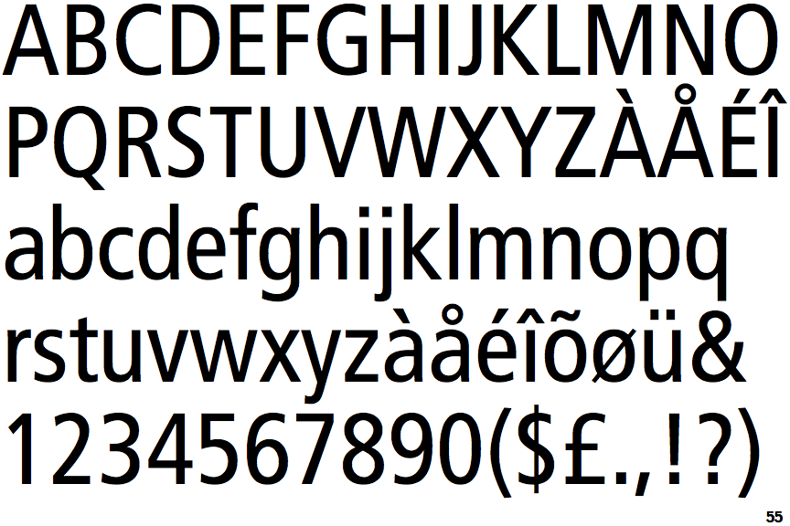
The '&' (ampersand) is traditional style with two enclosed loops.
|
 |
The tail of the lower-case 'y' is curved or U-shaped to the left.
|
 |
The ends of the upper-case 'C' stroke are vertical or nearly vertical.
|
 |
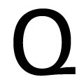
The tail of the upper-case 'Q' is diagonal.
|
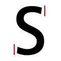 |
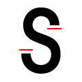
The ends of the upper-case 'S' stroke are vertical or nearly vertical.
|
 |
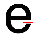
The end of the lower-case 'e' tail is vertical or nearly vertical.
|
Note that the fonts in the icons shown above represent general examples, not necessarily the two fonts chosen for comparison.
Show Examples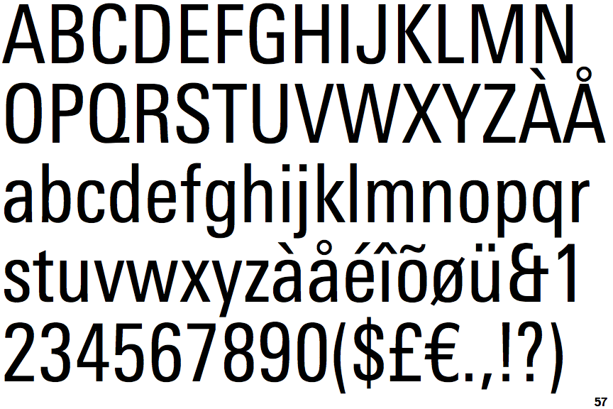
 |
The '&' (ampersand) looks like 'Et' with one enclosed loop (with or without exit stroke).
|
 |
The tail of the lower-case 'y' is substantially straight.
|
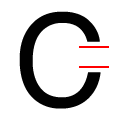 |
The ends of the upper-case 'C' stroke are horizontal or nearly horizontal.
|
 |
The tail of the upper-case 'Q' is horizontal.
|
 |
The ends of the upper-case 'S' stroke are horizontal or nearly horizontal.
|
 |
The end of the lower-case 'e' tail is horizontal or nearly horizontal.
|