 |
The upper-case 'J' descends below the baseline.
|
 |
The diagonal strokes of the upper-case 'K' meet at the vertical (with or without a gap).
|
 |
The lower-case 'g' is double-storey (with or without gap).
|
 |
The upper-case 'U' has no stem/serif.
|
 |
The upper-case 'Y' arms and tail are separate strokes.
|
 |
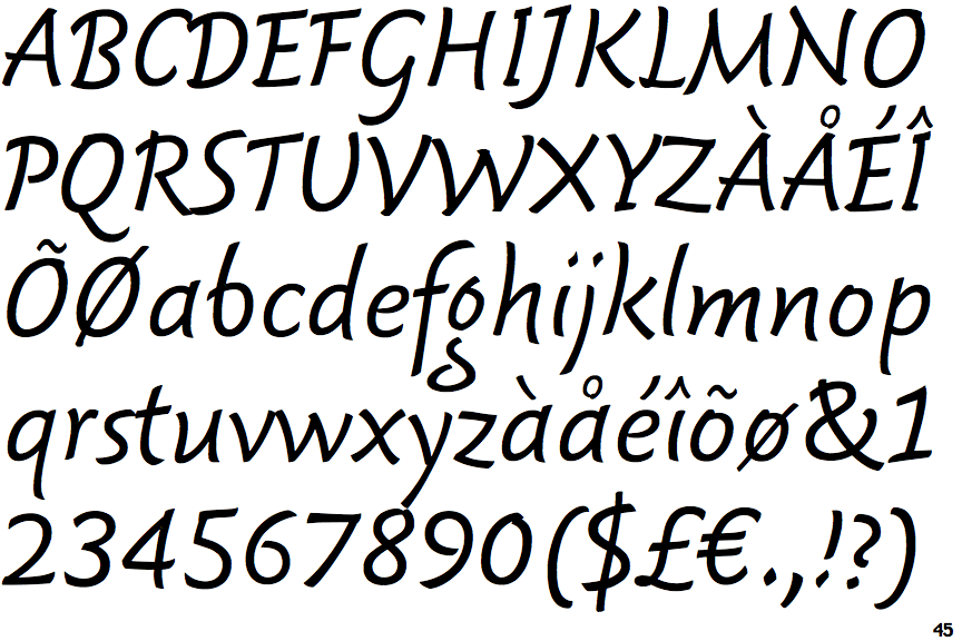
The strokes are sloped right (italic, oblique, or cursive).
|
 |
The sides of the lower-case 'y' are angled (V-shaped).
|
 |
The '7' has no bar.
|
 |
The upper-case letter 'I' has serifs/bars.
|
 |
The tail of the lower-case 'f' descends below the baseline.
|
Note that the fonts in the icons shown above represent general examples, not necessarily the two fonts chosen for comparison.
Show Examples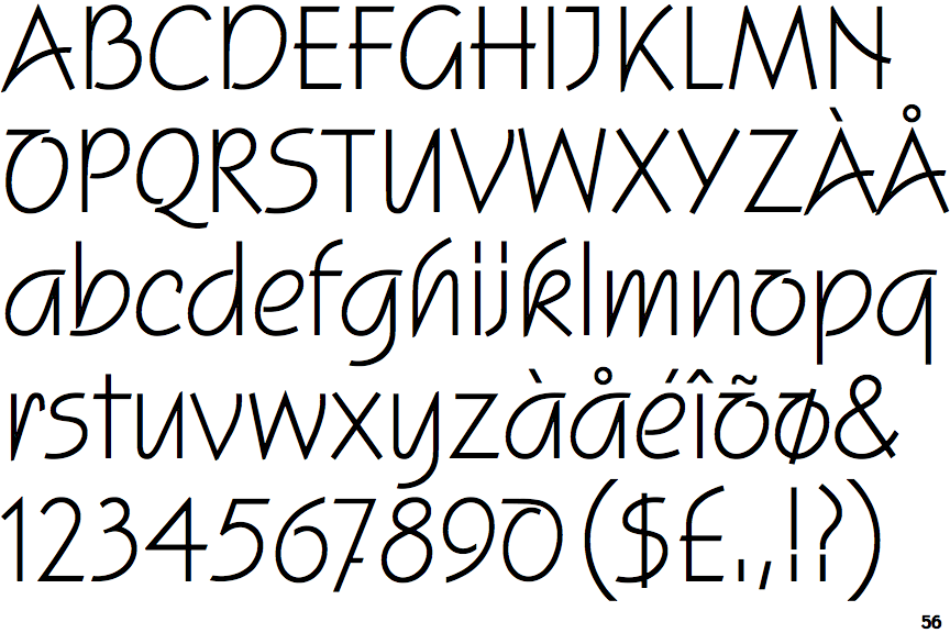
 |
The upper-case 'J' sits on the baseline.
|
 |
The diagonal strokes of the upper-case 'K' meet in a 'T'.
|
 |
The lower-case 'g' is single-storey (with or without loop).
|
 |
The upper-case 'U' has a stem/serif.
|
 |
The upper-case 'Y' right-hand arm forms a continuous stroke with the tail.
|
 |
The strokes are upright.
|
 |
The sides of the lower-case 'y' are parallel (U-shaped).
|
 |
The '7' has a bar.
|
 |
The upper-case letter 'I' is plain.
|
 |
The tail of the lower-case 'f' sits on the baseline.
|