Identifont

Fonts by Appearance

Fonts by Name

Fonts by Similarity

Fonts by Picture

Fonts by Designer/Publisher

Differences

TweetTweet Differences

Compare: and  

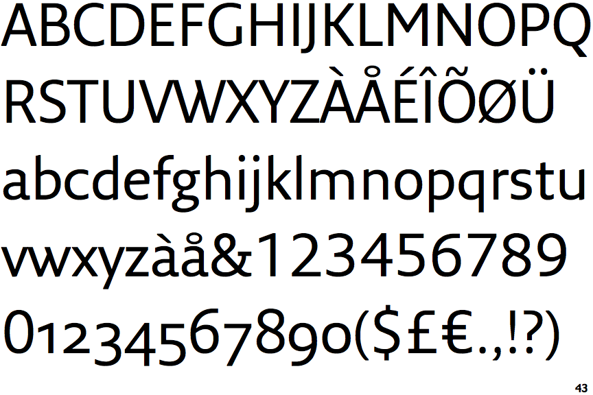
Fresco Sans

Fresco Sans

Bar
The diagonal strokes of the upper-case 'K' connect to the vertical via a horizontal bar.
Parallel
The verticals of the upper-case 'M' are parallel.
Plain
The 'l' (lower-case 'L') has no serifs or tail.
Stepped-Left
The centre strokes of the upper-case 'W' meet in a T on the left.

Note that the fonts in the icons shown above represent general examples, not necessarily the two fonts chosen for comparison.

Show Examples
Seravek

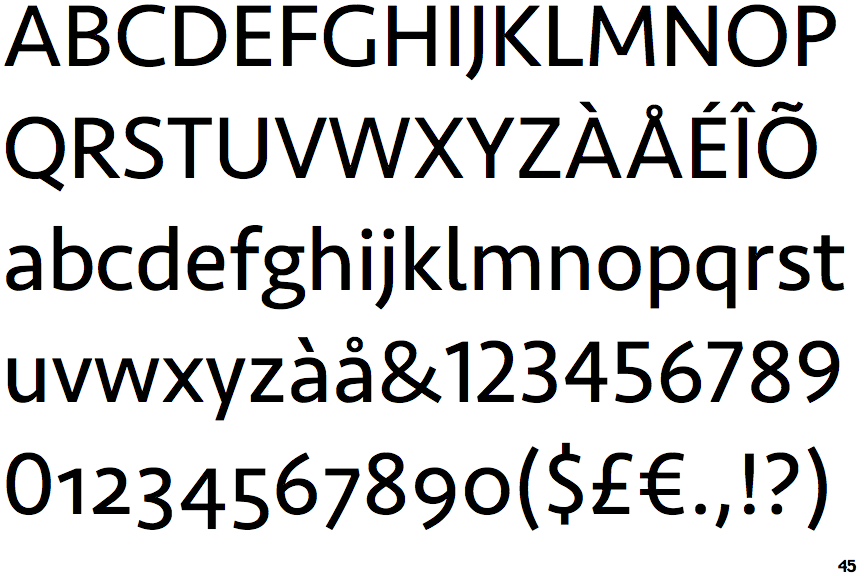
Seravek

Single
The diagonal strokes of the upper-case 'K' meet at the vertical (with or without a gap).
Sloping
The verticals of the upper-case 'M' are sloping.
Right
The 'l' (lower-case 'L') has a right-facing lower serif or tail.
Vertex
The centre strokes of the upper-case 'W' meet at a vertex.