 |
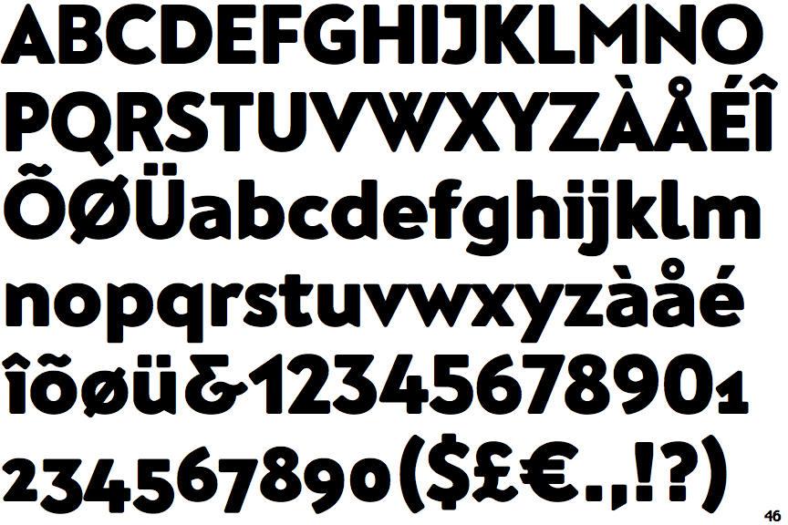
The upper-case 'Q' tail touches the circle.
|
 |
The '&' (ampersand) looks like 'Et' with a gap at the top.
|
 |
The '4' is open.
|
 |
The top storey of the '3' is a sharp angle.
|
 |
The lower-case 'a' stem curves over the top of the bowl (double storey).
|
 |
The 'l' (lower-case 'L') has a right-facing lower serif or tail.
|
 |
The right side of the upper-case 'G' has a flat section.
|
 |
The lower-case 'u' has a stem/serif.
|
 |
The lower-case 'i' has a left-facing upper serif.
|
 |
The top of the upper-case 'W' has four upper terminals.
|
There are more than ten differences; only the first ten are shown.
Note that the fonts in the icons shown above represent general examples, not necessarily the two fonts chosen for comparison.
Show Examples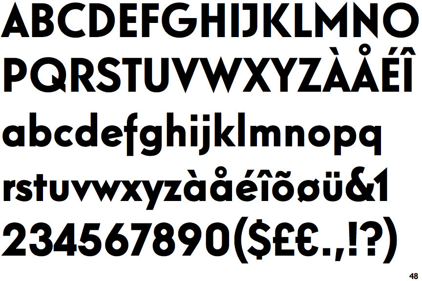
 |
The upper-case 'Q' tail crosses the circle.
|
 |
The '&' (ampersand) is traditional style with a gap at the top.
|
 |
The '4' is closed.
|
 |
The top storey of the '3' is a smooth curve.
|
 |
The lower-case 'a' stem stops at the top of the bowl (single storey).
|
 |
The 'l' (lower-case 'L') has no serifs or tail.
|
 |
The right side of the upper-case 'G' is curved.
|
 |
The lower-case 'u' has no stem/serif.
|
 |
The lower-case 'i' has no serifs or tail.
|
 |
The top of the upper-case 'W' has three upper terminals.
|