 |
The upper-case 'Q' tail touches the circle.
|
 |
The '1' (digit one) has double-sided base or serifs.
|
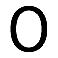 |
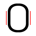
The verticals of the upper-case letter 'O' are fully curved.
|
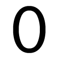 |
The verticals of the digit '0' are fully curved.
|
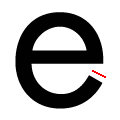 |
The end of the lower-case 'e' tail is angled.
|
Note that the fonts in the icons shown above represent general examples, not necessarily the two fonts chosen for comparison.
Show Examples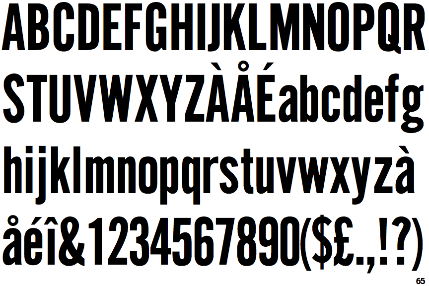
 |
The upper-case 'Q' tail crosses the circle.
|
 |
The '1' (digit one) has no base.
|
 |
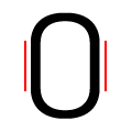
The verticals of the upper-case letter 'O' have straight segments.
|
 |
The verticals of the digit '0' have straight segments.
|
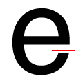 |
The end of the lower-case 'e' tail is horizontal or nearly horizontal.
|