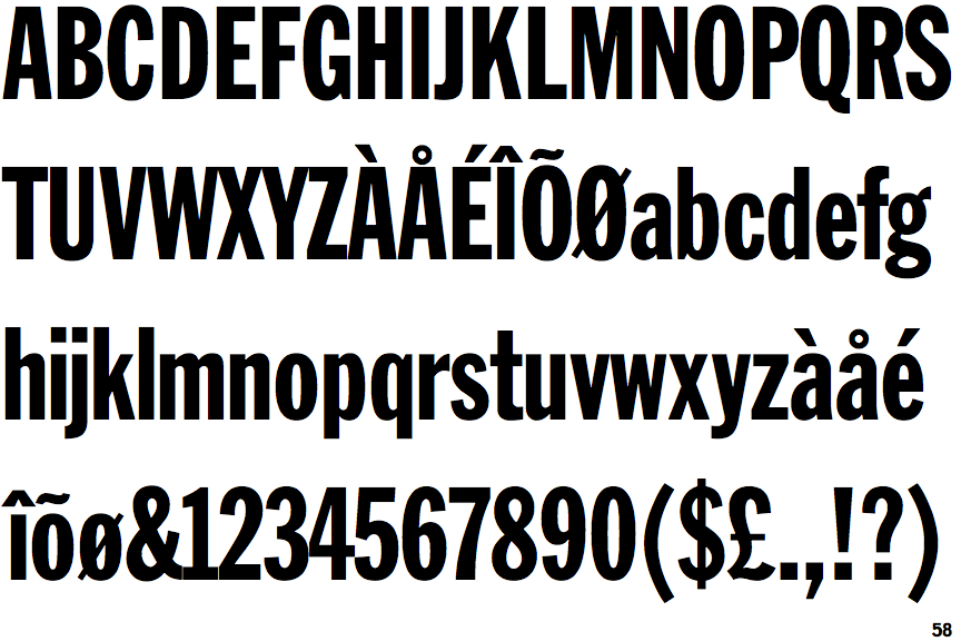
 |
The diagonal strokes of the upper-case 'K' meet in a 'T'.
|
 |
The leg of the upper-case 'R' is straight.
|
 |
The '1' (digit one) has double-sided base or serifs.
|
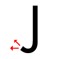 |
The tail of the upper-case 'J' points horizontally or slightly upwards.
|
 |
The diagonal strokes of the lower-case 'k' meet in a 'T'.
|
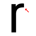 |
The arm of the lower-case 'r' points upwards or slightly downwards.
|
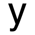 |
The tail of the lower-case 'y' is curved to the left or slightly upwards.
|
 |
The foot of the '£' (pound) has no loop.
|
Note that the fonts in the icons shown above represent general examples, not necessarily the two fonts chosen for comparison.
Show Examples
 |
The diagonal strokes of the upper-case 'K' meet at the vertical (with or without a gap).
|
 |
The leg of the upper-case 'R' is curved outwards.
|
 |
The '1' (digit one) has no base.
|
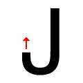 |
The tail of the upper-case 'J' points vertically.
|
 |
The diagonal strokes of the lower-case 'k' meet at the vertical (with or without a gap).
|
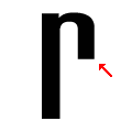 |
The arm of the lower-case 'r' points downwards.
|
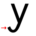 |
The tail of the lower-case 'y' is U-shaped.
|
 |
The foot of the '£' (pound) has a loop.
|