Identifont

Fonts by Appearance

Fonts by Name

Fonts by Similarity

Fonts by Picture

Fonts by Designer/Publisher

Differences

TweetTweet Differences

Compare: and  

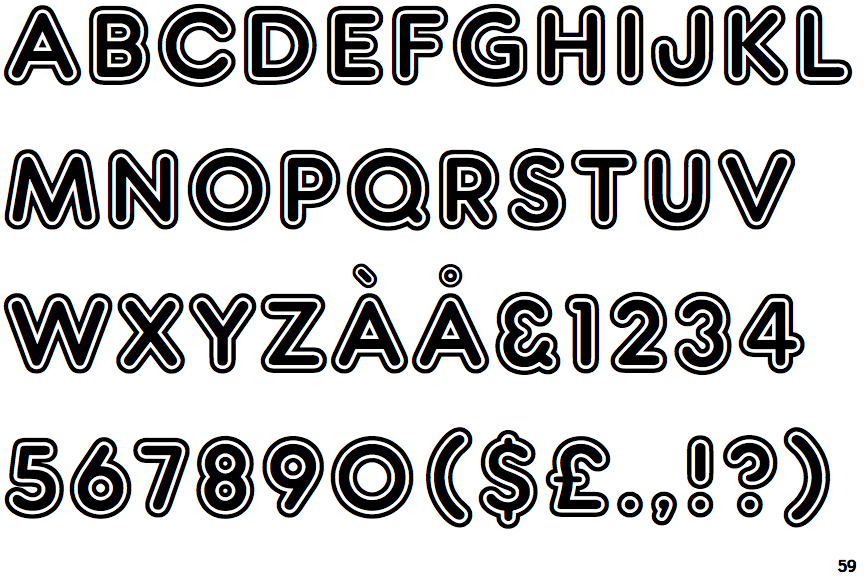
Frankfurter Inline

Frankfurter Inline

Baseline
The centre vertex of the upper-case 'M' is on the baseline.
Left
The upper-case 'G' has a bar to the left.
Three
The upper-case 'Y' arms and tail are separate strokes.
Normal
The upper-case 'E' is normal letter shape.

Note that the fonts in the icons shown above represent general examples, not necessarily the two fonts chosen for comparison.

Show Examples
Zambesi

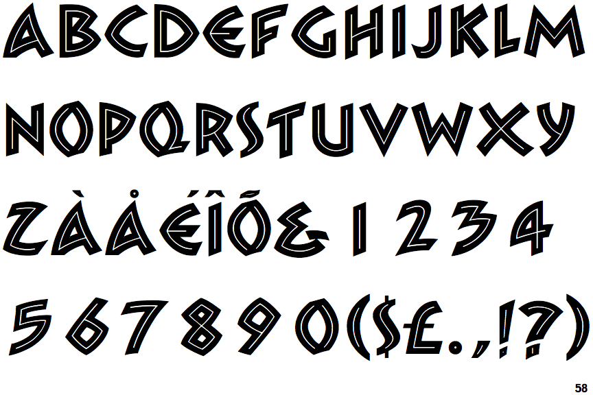
Zambesi

Above
The centre vertex of the upper-case 'M' is above the baseline.
No bar
The upper-case 'G' has no bar.
Two
The upper-case 'Y' right-hand arm forms a continuous stroke with the tail.
C-bar
The upper-case 'E' is drawn as a 'C' with a bar.