 |
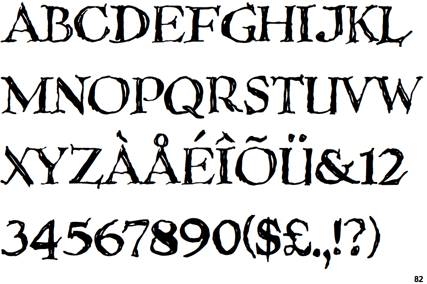
The '&' (ampersand) is traditional style with a gap at the top.
|
 |
The characters have serifs.
|
 |
The '4' is closed.
|
 |
The diagonal strokes of the upper-case 'K' meet in a 'T'.
|
 |
The verticals of the upper-case 'M' are parallel.
|
 |
The centre bar of the upper-case 'P' leaves a gap with the vertical.
|
 |
The upper-case 'U' has a stem/serif.
|
 |
The strokes are upright.
|
 |
The tail of the upper-case 'Q' is curved or S-shaped.
|
 |
The upper-case 'I' is a single stroke with serifs.
|
There are more than ten differences; only the first ten are shown.
Note that the fonts in the icons shown above represent general examples, not necessarily the two fonts chosen for comparison.
Show Examples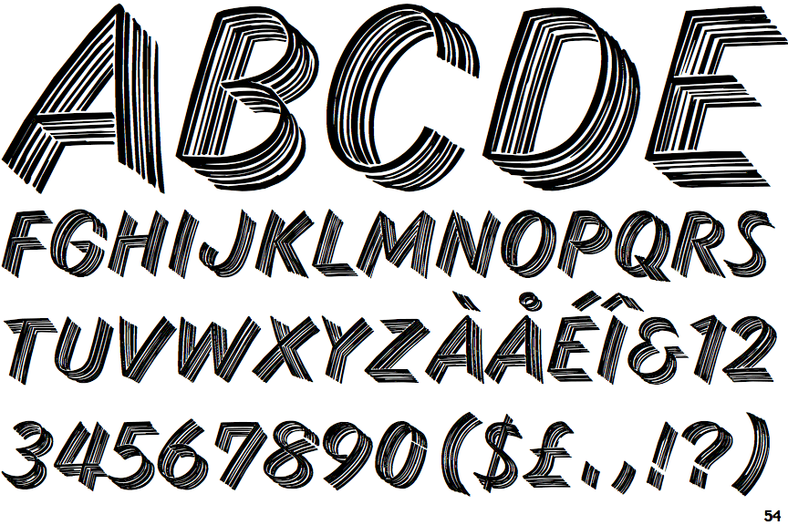
 |
The '&' (ampersand) looks like 'Et' with a gap at the top.
|
 |
The characters do not have serifs.
|
 |
The '4' is open.
|
 |
The diagonal strokes of the upper-case 'K' meet at the vertical (with or without a gap).
|
 |
The verticals of the upper-case 'M' are sloping.
|
 |
The centre bar of the upper-case 'P' meets the vertical.
|
 |
The upper-case 'U' has no stem/serif.
|
 |
The strokes are sloped right (italic, oblique, or cursive).
|
 |
The tail of the upper-case 'Q' is straight.
|
 |
The upper-case 'I' is a single stroke with no serifs.
|