Identifont

Fonts by Appearance

Fonts by Name

Fonts by Similarity

Fonts by Picture

Fonts by Designer/Publisher

Differences

TweetTweet Differences

Compare: and  

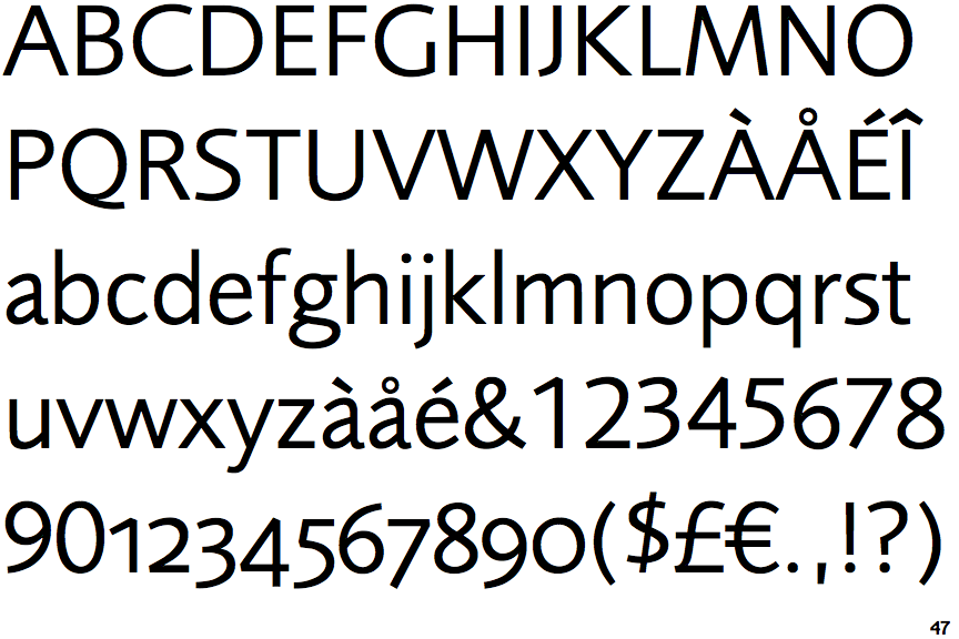
Foundry Sans

Foundry Sans

Closed
The '&' (ampersand) is traditional style with two enclosed loops.
On
The upper-case 'J' sits on the baseline.
Sloping
The verticals of the upper-case 'M' are sloping.
Spur
The top of the lower-case 'q' has a vertical or slightly angled spur (pointed or flat).
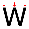
Three
The top of the upper-case 'W' has three upper terminals.

Note that the fonts in the icons shown above represent general examples, not necessarily the two fonts chosen for comparison.

Show Examples
Scala Sans

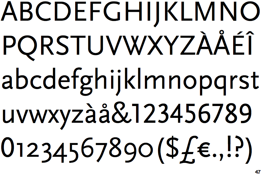
Scala Sans

Open
The '&' (ampersand) is traditional style with a gap at the top.
Below
The upper-case 'J' descends below the baseline.
Parallel
The verticals of the upper-case 'M' are parallel.
Missing
The top of the lower-case 'q' has no spur or serif.
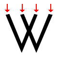
Four
The top of the upper-case 'W' has four upper terminals.