 |
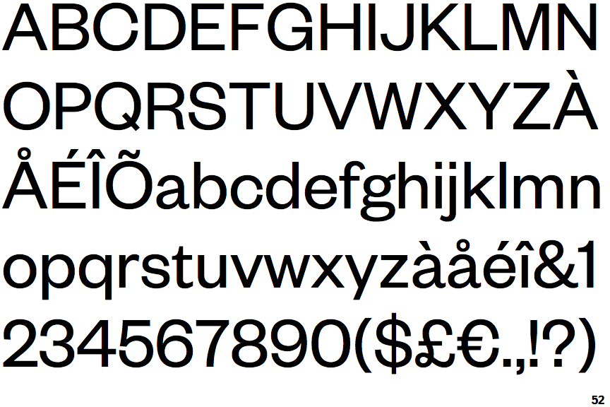
The top storey of the '3' is a smooth curve.
|
 |
The lower-case 'g' is double-storey (with or without gap).
|
 |
The leg of the upper-case 'R' is curved outwards.
|
 |
The tail of the upper-case 'Q' is straight.
|
 |
The tail of the lower-case 'y' is substantially straight.
|
 |
The bar of the '4' crosses the vertical.
|
Note that the fonts in the icons shown above represent general examples, not necessarily the two fonts chosen for comparison.
Show Examples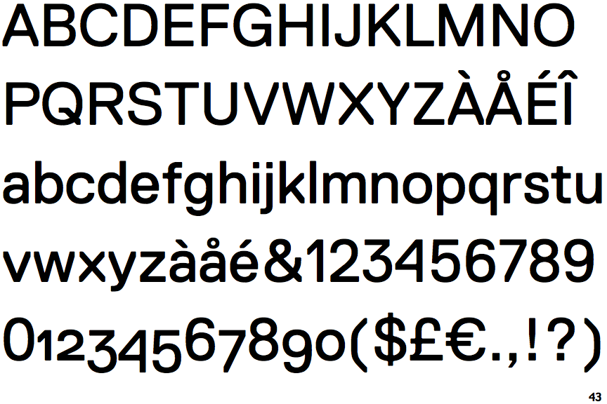
 |
The top storey of the '3' is a sharp angle.
|
 |
The lower-case 'g' is single-storey (with or without loop).
|
 |
The leg of the upper-case 'R' is straight.
|
 |
The tail of the upper-case 'Q' is curved or S-shaped.
|
 |
The tail of the lower-case 'y' is curved or U-shaped to the left.
|
 |
The bar of the '4' does not cross the vertical.
|