

 |
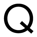
The upper-case 'Q' tail crosses the circle.
|
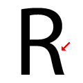 |
The leg of the upper-case 'R' is curved outwards.
|
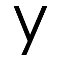 |
The tail of the lower-case 'y' is substantially straight.
|
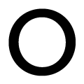 |
The lower-case letter 'o' is circular or equal proportions.
|
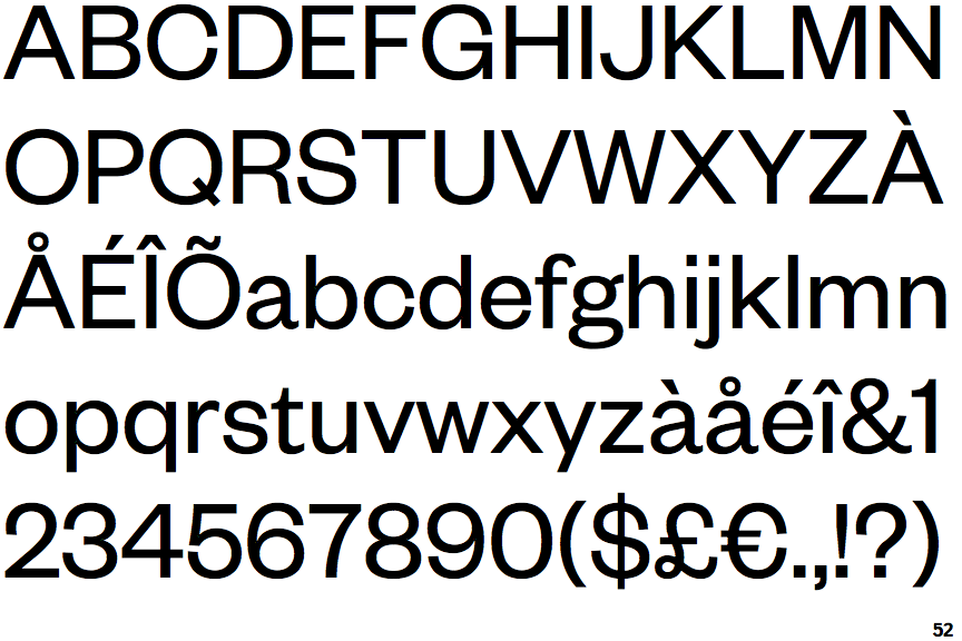
Note that the fonts in the icons shown above represent general examples, not necessarily the two fonts chosen for comparison.
Show Examples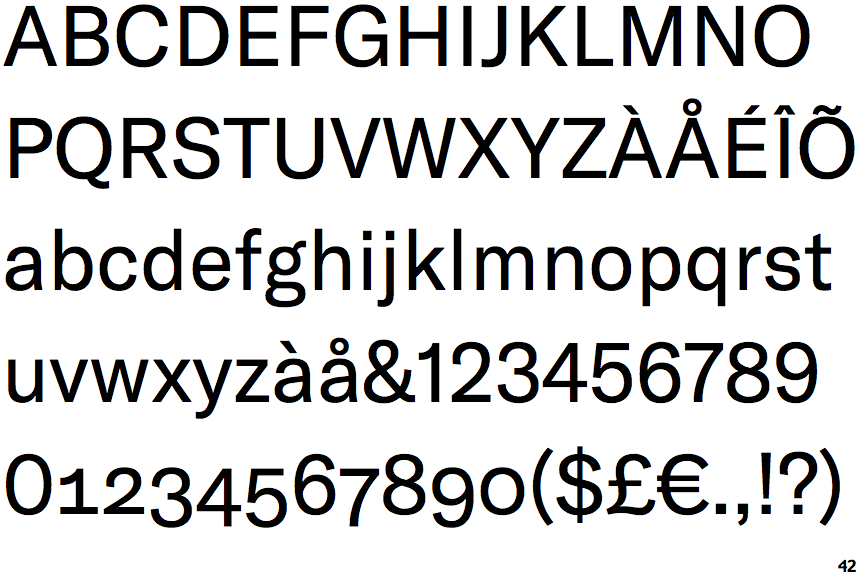
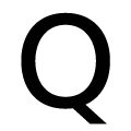 |
The upper-case 'Q' tail touches the circle.
|
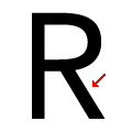 |
The leg of the upper-case 'R' is straight.
|
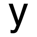 |
The tail of the lower-case 'y' is curved or U-shaped to the left.
|
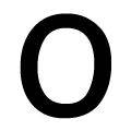 |
The lower-case letter 'o' is taller than it is wide.
|