 |
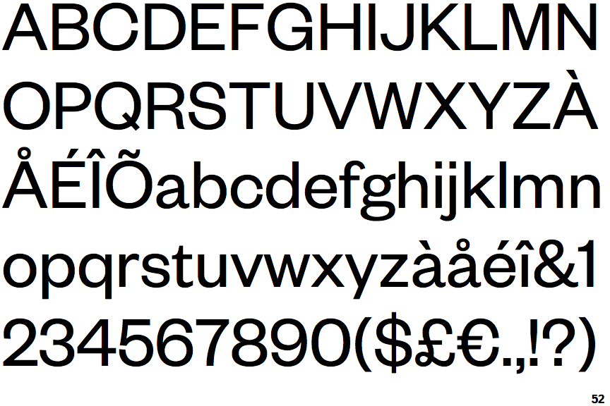
The leg of the upper-case 'R' is curved outwards.
|
 |
The tail of the lower-case 'y' is substantially straight.
|
 |
The tail of the upper-case 'Q' is straight.
|
 |
The '1' (digit one) has no base.
|
 |
The top of the '7' has no serif or bar.
|
 |
The lower-case 't' has double-sided bar which forms a diagonal with the vertical.
|
 |
The foot of the '£' (pound) has a loop.
|
Note that the fonts in the icons shown above represent general examples, not necessarily the two fonts chosen for comparison.
Show Examples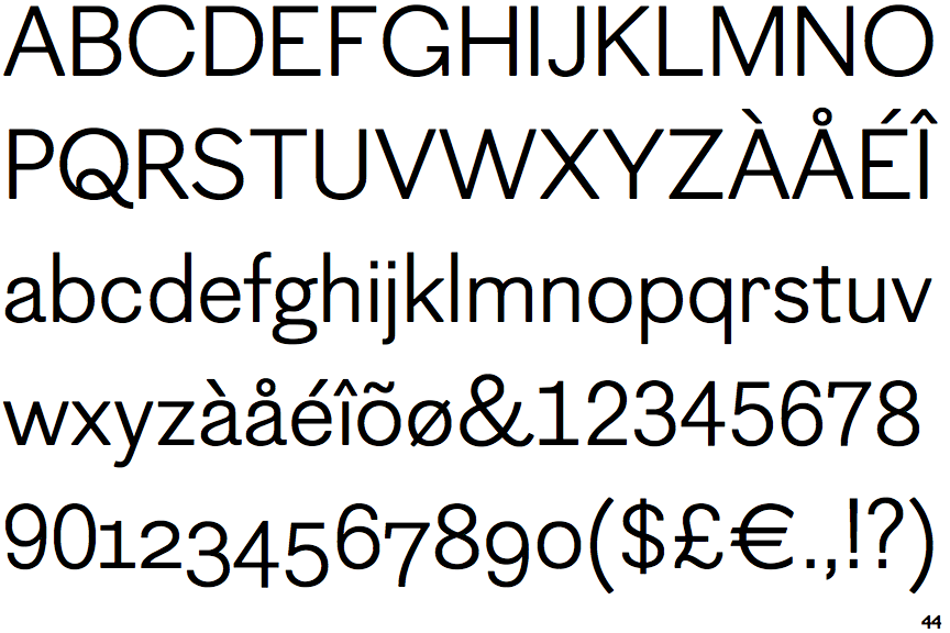
 |
The leg of the upper-case 'R' is straight.
|
 |
The tail of the lower-case 'y' is curved or U-shaped to the left.
|
 |
The tail of the upper-case 'Q' is curved or S-shaped.
|
 |
The '1' (digit one) has double-sided base or serifs.
|
 |
The top of the '7' has a downward-pointing serif or bar.
|
 |
The lower-case 't' has double-sided bar which forms a right-angle with the vertical.
|
 |
The foot of the '£' (pound) has no loop.
|