Identifont

Fonts by Appearance

Fonts by Name

Fonts by Similarity

Fonts by Picture

Fonts by Designer/Publisher

Differences

TweetTweet Differences

Compare: and  

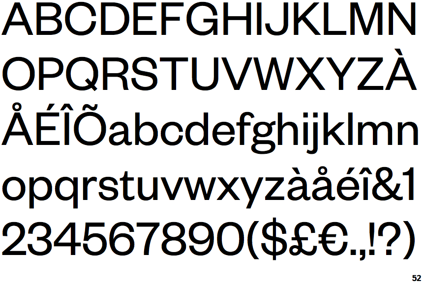
Founders Grotesk

Founders Grotesk

Crosses
The upper-case 'Q' tail crosses the circle.
2-Storey
The lower-case 'g' is double-storey (with or without gap).
Outwards
The leg of the upper-case 'R' is curved outwards.
Straight
The tail of the lower-case 'y' is substantially straight.

Note that the fonts in the icons shown above represent general examples, not necessarily the two fonts chosen for comparison.

Show Examples
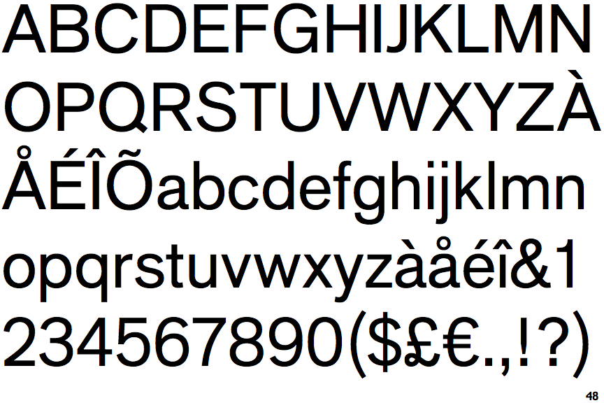
Applied Sans

Applied Sans

Touches
The upper-case 'Q' tail touches the circle.
1-Storey
The lower-case 'g' is single-storey (with or without loop).
Straight
The leg of the upper-case 'R' is straight.
Left
The tail of the lower-case 'y' is curved or U-shaped to the left.