 |
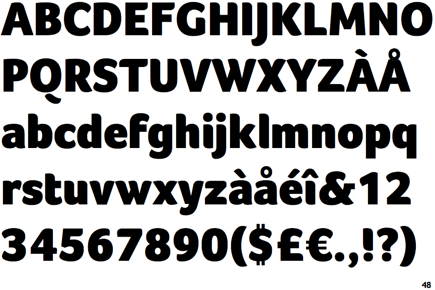
The upper-case 'Q' tail is below and separated from the circle.
|
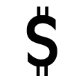 |
The '$' (dollar) has a double line which does not cross the 'S'.
|
 |
The '&' (ampersand) is traditional style with a gap at the top.
|
 |
The upper-case 'J' descends below the baseline.
|
 |
The characters do not have serifs.
|
 |
The centre vertex of the upper-case 'M' is above the baseline.
|
 |
The lower-case 'g' is single-storey (with or without loop).
|
 |
The top of the upper-case 'A' has no serifs or cusps.
|
 |
The bar of the lower-case 'f' is single-sided.
|
 |
The centre bar of the upper-case 'F' has no serifs.
|
Note that the fonts in the icons shown above represent general examples, not necessarily the two fonts chosen for comparison.
Show Examples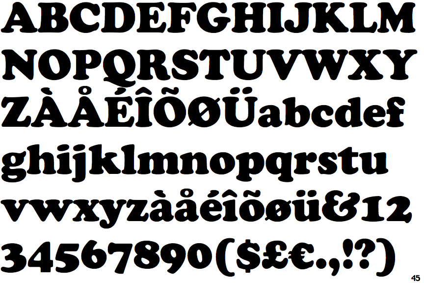
 |
The upper-case 'Q' tail touches the circle.
|
 |
The '$' (dollar) has a single line which does not cross the 'S'.
|
 |
The '&' (ampersand) looks like 'Et' with a gap at the top.
|
 |
The upper-case 'J' sits on the baseline.
|
 |
The characters have serifs.
|
 |
The centre vertex of the upper-case 'M' is on the baseline.
|
 |
The lower-case 'g' is double-storey (with or without gap).
|
 |
The top of the upper-case 'A' has a serif or cusp on the left.
|
 |
The bar of the lower-case 'f' is double-sided.
|
 |
The centre bar of the upper-case 'F' has serifs.
|