Identifont

Fonts by Appearance

Fonts by Name

Fonts by Similarity

Fonts by Picture

Fonts by Designer/Publisher

Differences

TweetTweet Differences

Compare: and  

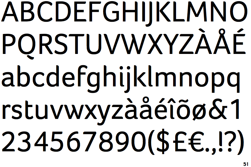
Foco

Foco

Below
The upper-case 'Q' tail is below and separated from the circle.
Open
The '&' (ampersand) is traditional style with a gap at the top.
Above
The centre vertex of the upper-case 'M' is above the baseline.
Left
The upper-case 'G' has a bar to the left.
Stepped-Left
The centre strokes of the upper-case 'W' meet in a T on the left.

Note that the fonts in the icons shown above represent general examples, not necessarily the two fonts chosen for comparison.

Show Examples
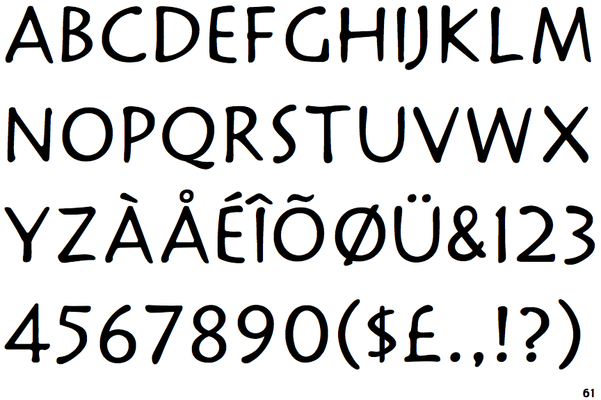
Mission

Mission

Touches
The upper-case 'Q' tail touches the circle.
Closed
The '&' (ampersand) is traditional style with two enclosed loops.
Baseline
The centre vertex of the upper-case 'M' is on the baseline.
No bar
The upper-case 'G' has no bar.
Vertex
The centre strokes of the upper-case 'W' meet at a vertex.